All Tips


Consistent Border-Radius
card
ui
visual effect
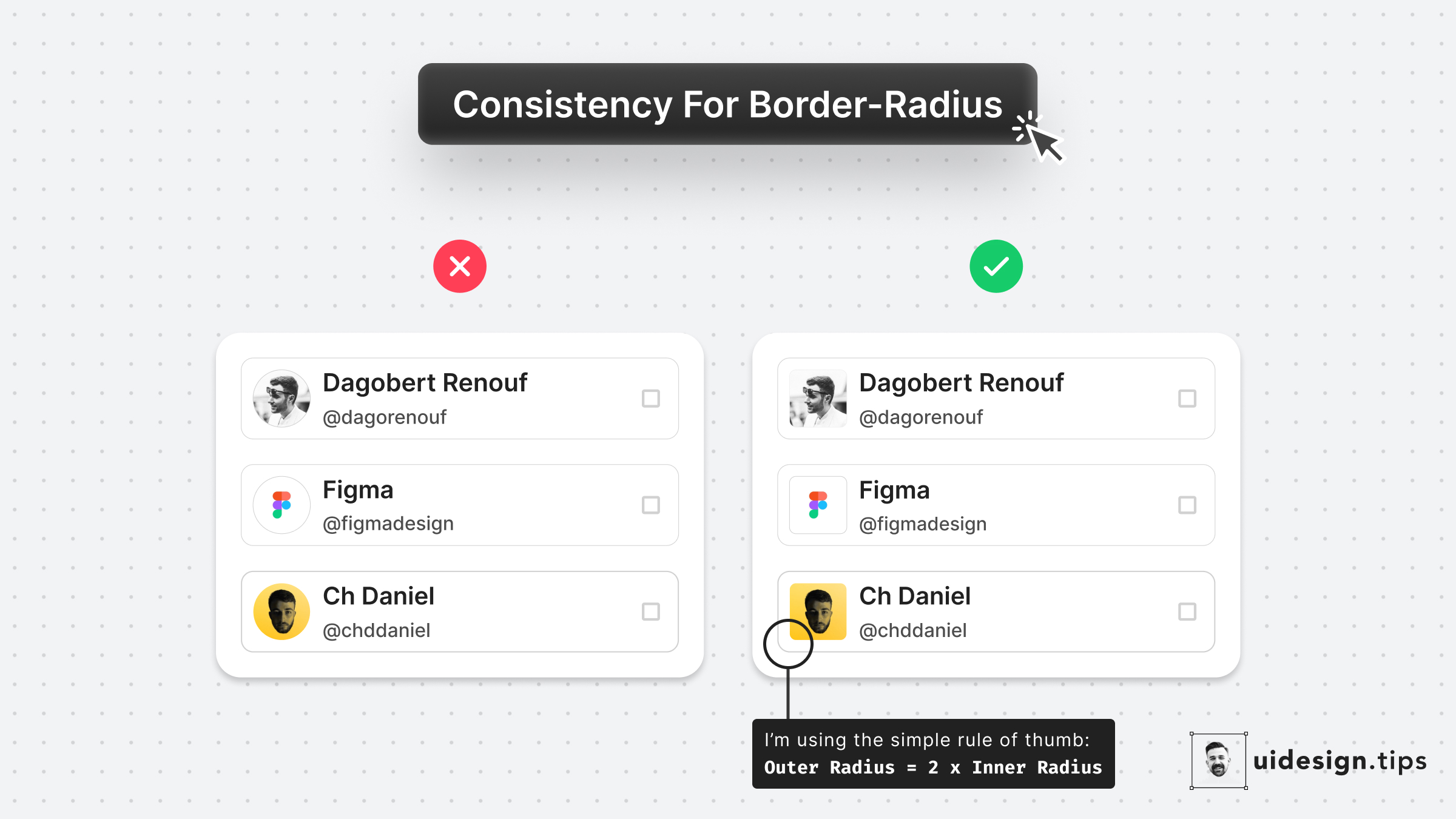
Round images usually look weird when they're included in a card with a small border-radius.
Use the simple rule of thumb:
𝙊𝙪𝙩𝙚𝙧 𝙍𝙖𝙙𝙞𝙪𝙨 = 2 * 𝙄𝙣𝙣𝙚𝙧 𝙍𝙖𝙙𝙞𝙪𝙨- The precise formula is more complicated since you need to take into account the spacing between the two borders, so let's it simple!

Become a Better Designer.
The Fun way.
Join 100s of developers, entrepreneurs & junior designers who strive to become better in UI & UX design with byte-sized, practical tips & examples!
Get notified about new tips & articles before anyone else!
"
I love these little tips. It’s like Dribbble but actually useful.
Martin LeBlanc
CEO of Iconfinder
"
I love UX & UI tips. Especially, when they are practical and presented in a very good way. Yours are meeting both criteria.
Lisa Dziuba
Head of Marketing at Abstract

