All Tips


Use Better Link Button
button
cta
ux
ui
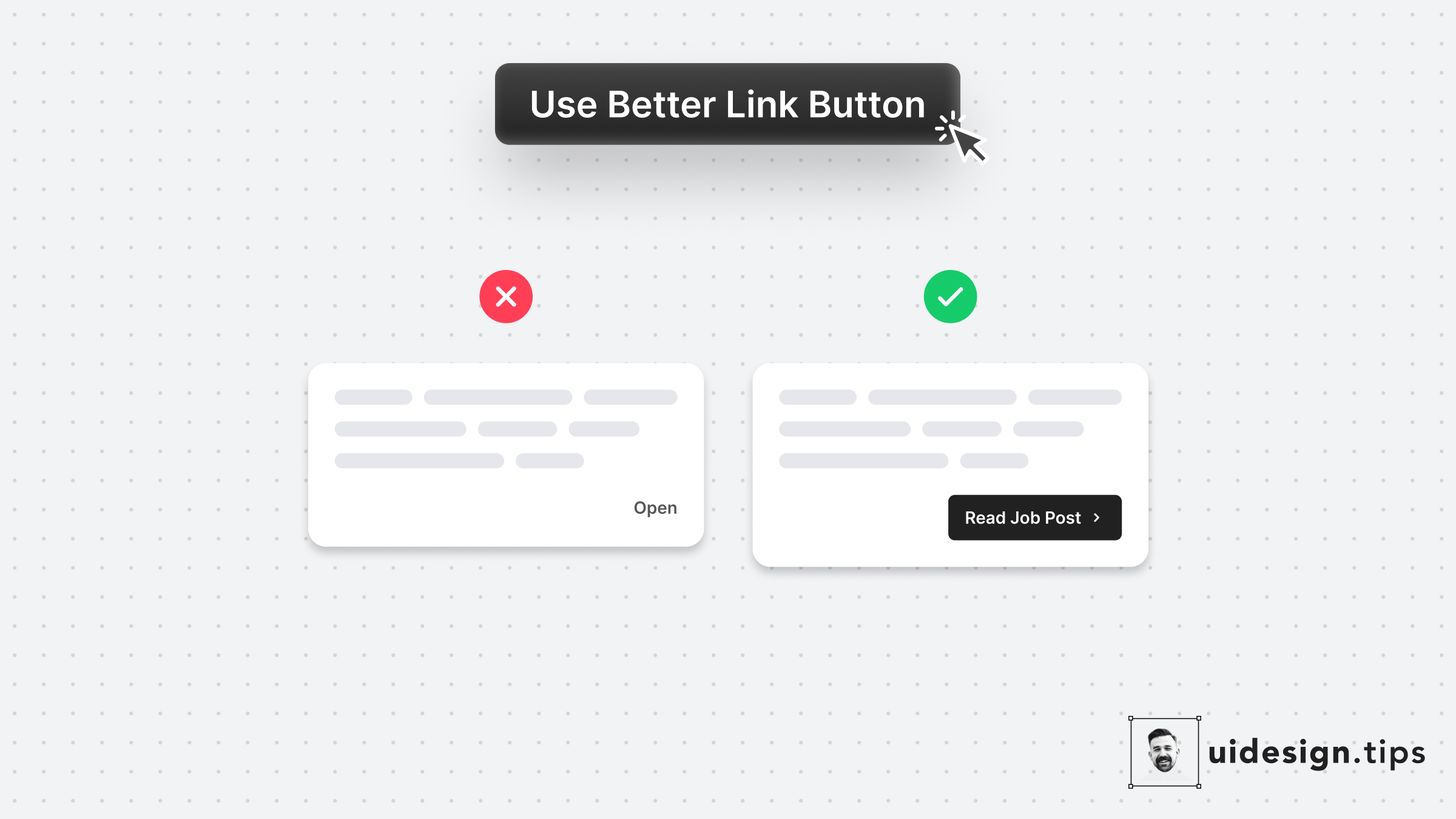
Links are important and you need to treat their appearance nicely.
Many times a traditional button works better than a single link.
Especially if the link is not on a header, footer, or the body of an article.
Always make the copy actionable and hint at the action they initiate.

Become a Better Designer.
The Fun way.
Join 100s of developers, entrepreneurs & junior designers who strive to become better in UI & UX design with byte-sized, practical tips & examples!
Get notified about new tips & articles before anyone else!
"
I love these little tips. It’s like Dribbble but actually useful.
Martin LeBlanc
CEO of Iconfinder
"
I love UX & UI tips. Especially, when they are practical and presented in a very good way. Yours are meeting both criteria.
Lisa Dziuba
Head of Marketing at Abstract


