All Tips


Highlight The Best Offer
hierarchy
ux
ui
conversions
pricing
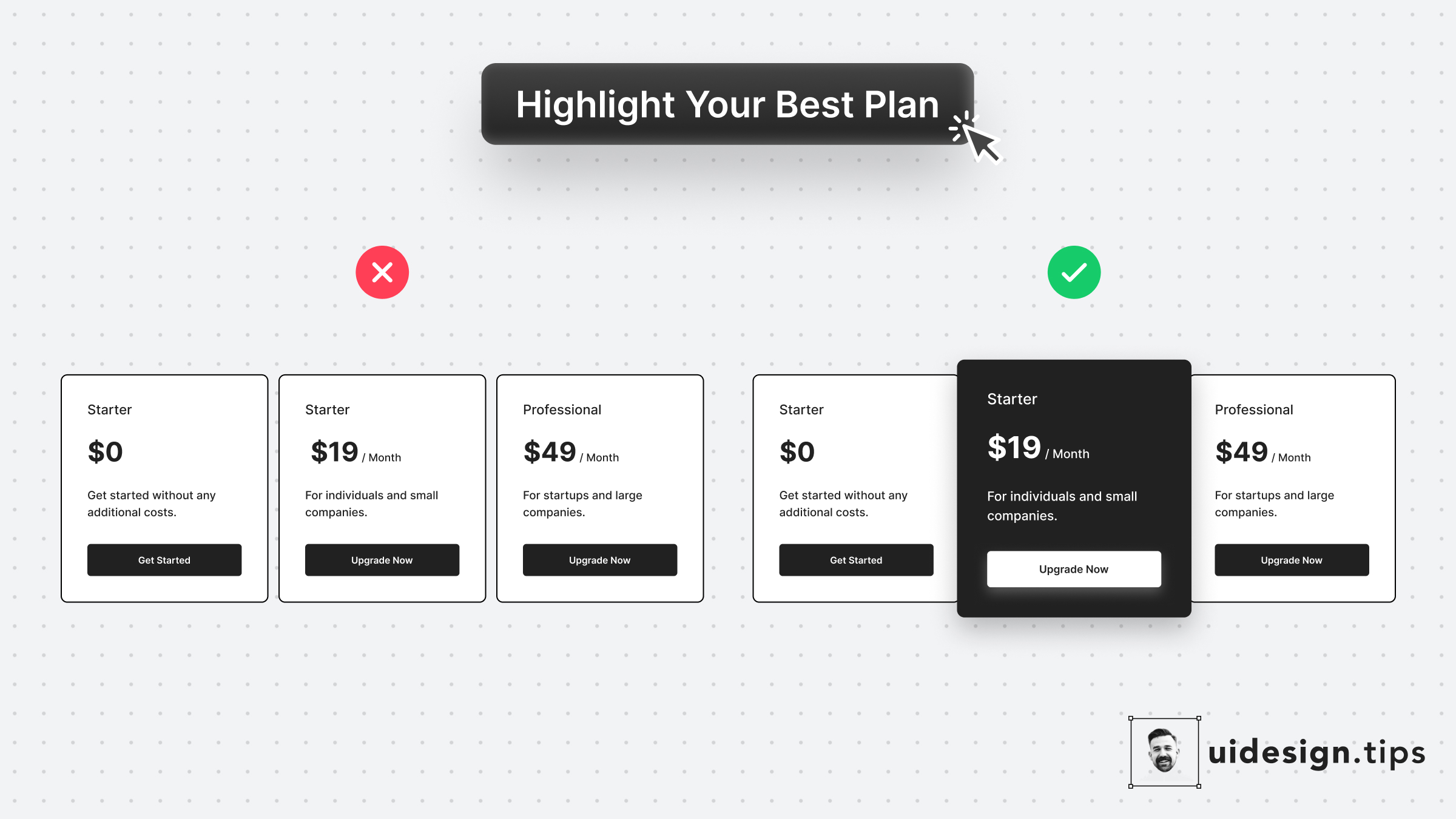
Always highlight your best pricing plan and make it pop out.
In that way, you help users identify the most used plan and you promote your top offer. It's a win-win situation.
To highlight the plan, use more than one design ways, eg. color, size, elevation (aka shadow)!

Become a Better Designer.
The Fun way.
Join 100s of developers, entrepreneurs & junior designers who strive to become better in UI & UX design with byte-sized, practical tips & examples!
Get notified about new tips & articles before anyone else!
"
I love these little tips. It’s like Dribbble but actually useful.
Martin LeBlanc
CEO of Iconfinder
"
I love UX & UI tips. Especially, when they are practical and presented in a very good way. Yours are meeting both criteria.
Lisa Dziuba
Head of Marketing at Abstract


