All Tips


Hack Visual Hierarchy
how
visual effect
hierarchy
ux
ui
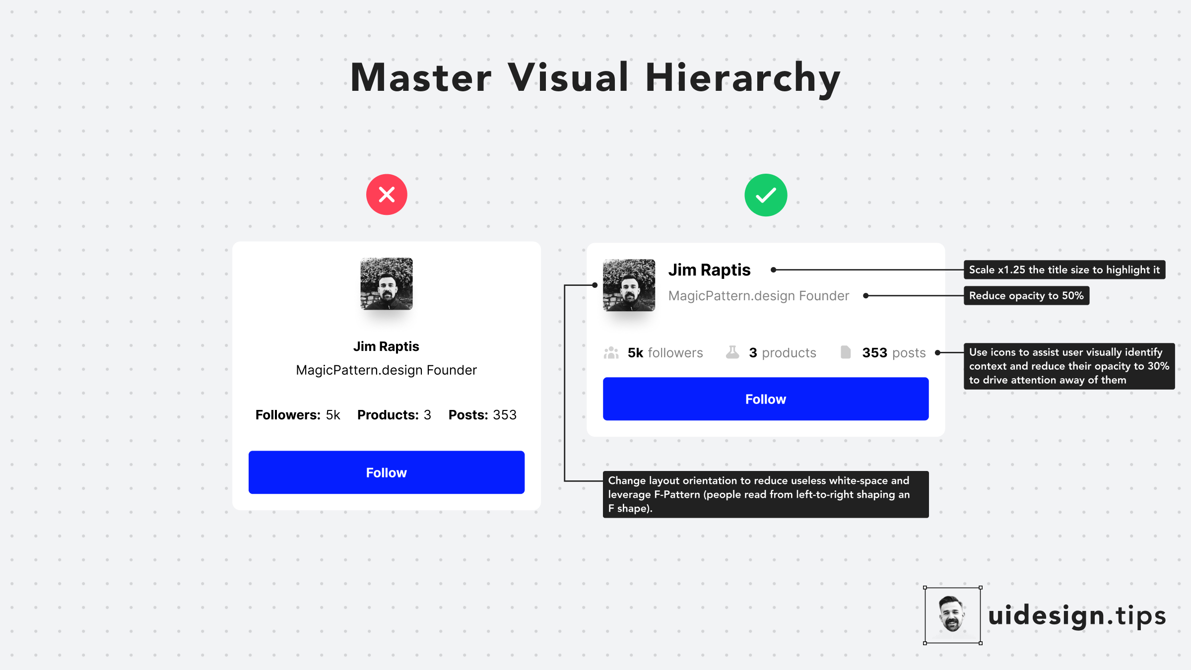
Hack visual hierarchy with these simple hacks:
• Reduce the opacity of secondary info • Use bold font-weight to emphasize • Scale your title's size by a fixed ratio (eg x1.25) • Arrange elements to the left side (for LTR users) • Group together relevant elements

Become a Better Designer.
The Fun way.
Join 100s of developers, entrepreneurs & junior designers who strive to become better in UI & UX design with byte-sized, practical tips & examples!
Get notified about new tips & articles before anyone else!
"
I love these little tips. It’s like Dribbble but actually useful.
Martin LeBlanc
CEO of Iconfinder
"
I love UX & UI tips. Especially, when they are practical and presented in a very good way. Yours are meeting both criteria.
Lisa Dziuba
Head of Marketing at Abstract


