All Tips


Make Cards Look Clickable
cta
button
card
ui
ux
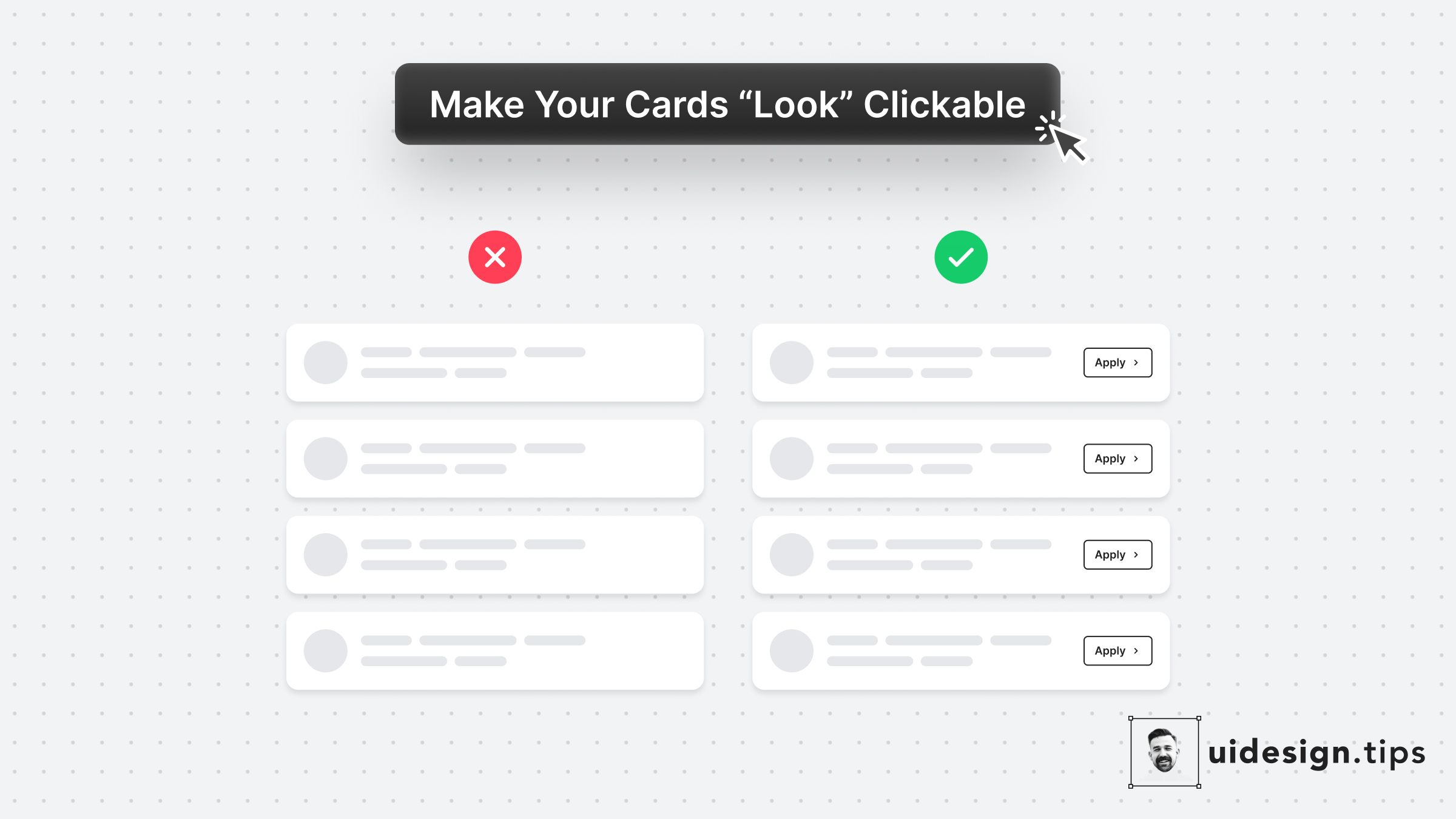
In many cases, cards fail to indicate that they're clickable.
Designers omit CTA buttons and only count on the user's experience or/and, hover effects.
In design, it's always a good practice to never leave things on user imagination.
Instead use an actionable button to prompt clickability and describe the action.

Become a Better Designer.
The Fun way.
Join 100s of developers, entrepreneurs & junior designers who strive to become better in UI & UX design with byte-sized, practical tips & examples!
Get notified about new tips & articles before anyone else!
"
I love these little tips. It’s like Dribbble but actually useful.
Martin LeBlanc
CEO of Iconfinder
"
I love UX & UI tips. Especially, when they are practical and presented in a very good way. Yours are meeting both criteria.
Lisa Dziuba
Head of Marketing at Abstract


