All Tips


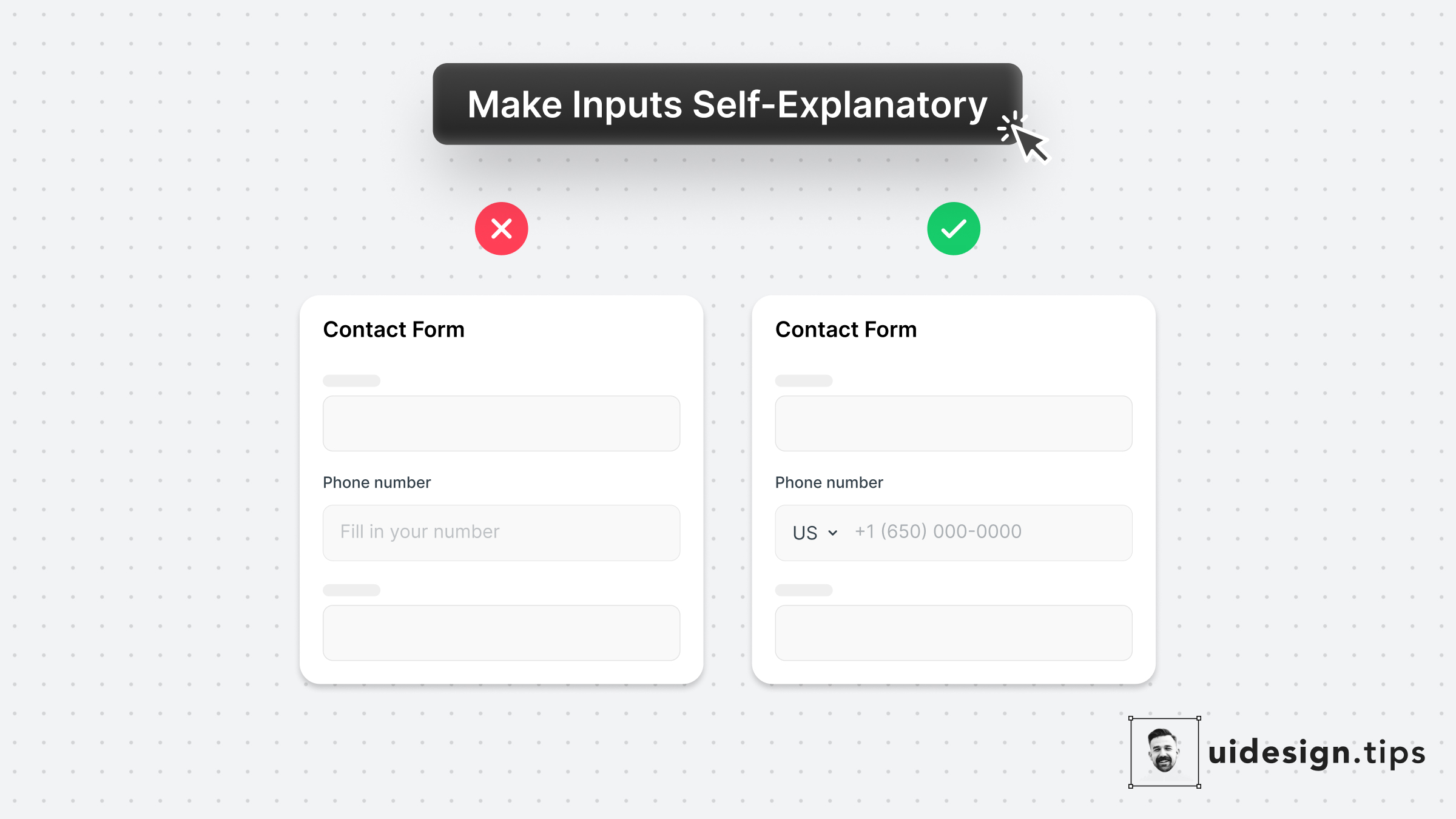
Make Inputs Self-Explanatory
forms
input
ui
ux
The two "secret" weapons to enhance your input fields are the placeholder text & its type.⠀ ⠀
- Leverage the placeholder text to guide users instead of just repeating the label. ⠀ ⠀
- Limit the wrong input source (eg add country code) by using predefined values for common inputs.⠀

Become a Better Designer.
The Fun way.
Join 100s of developers, entrepreneurs & junior designers who strive to become better in UI & UX design with byte-sized, practical tips & examples!
Get notified about new tips & articles before anyone else!
"
I love these little tips. It’s like Dribbble but actually useful.
Martin LeBlanc
CEO of Iconfinder
"
I love UX & UI tips. Especially, when they are practical and presented in a very good way. Yours are meeting both criteria.
Lisa Dziuba
Head of Marketing at Abstract


