UI Tips
UX Tips
Articles
Newsletter
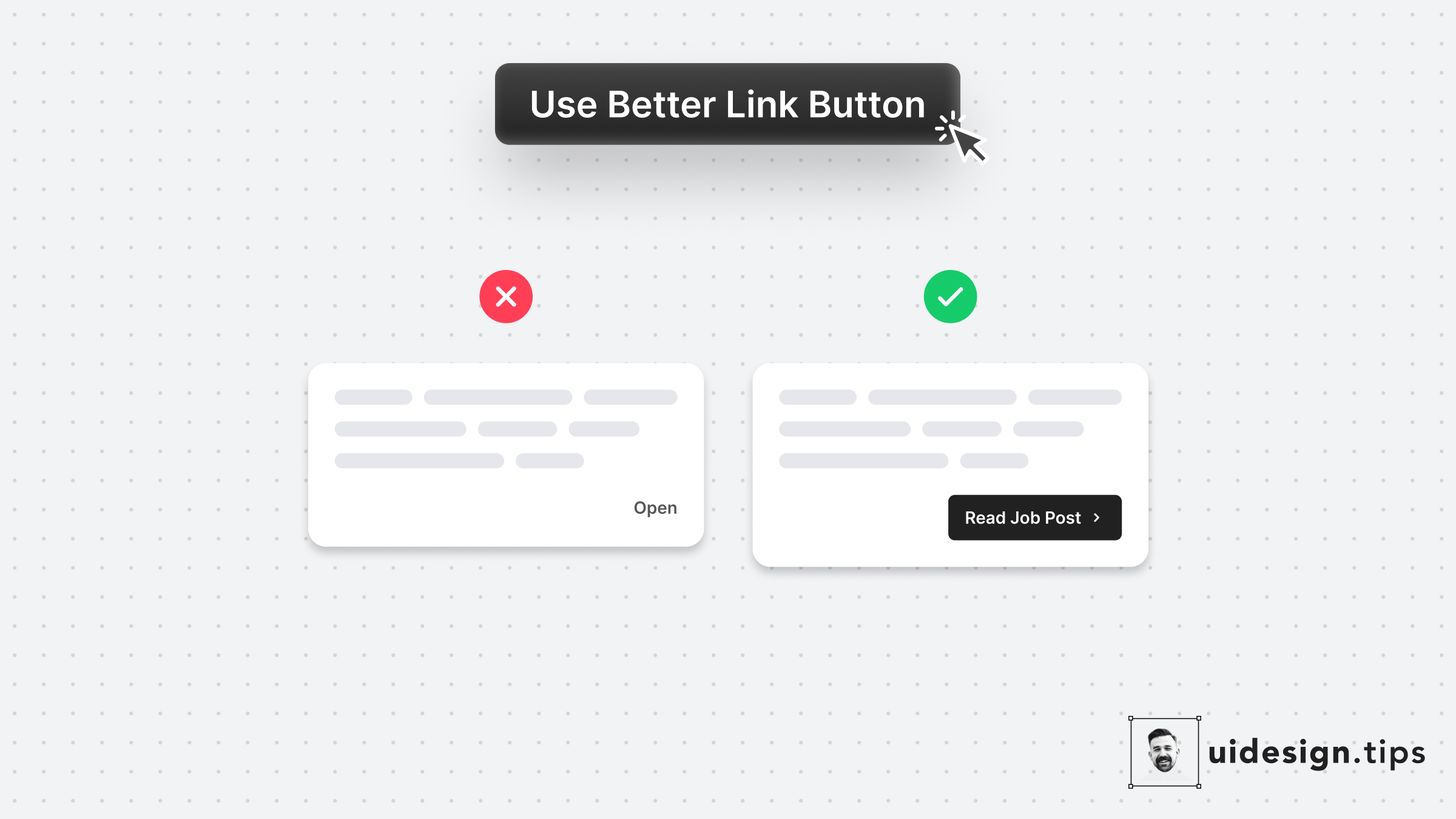
Links are important and you need to treat their appearance nicely. Many times a traditional button works better than a single link. Especially if the link is not on a header, footer, or the body of an article. Always make the copy actionable and hint at the action they initiate.
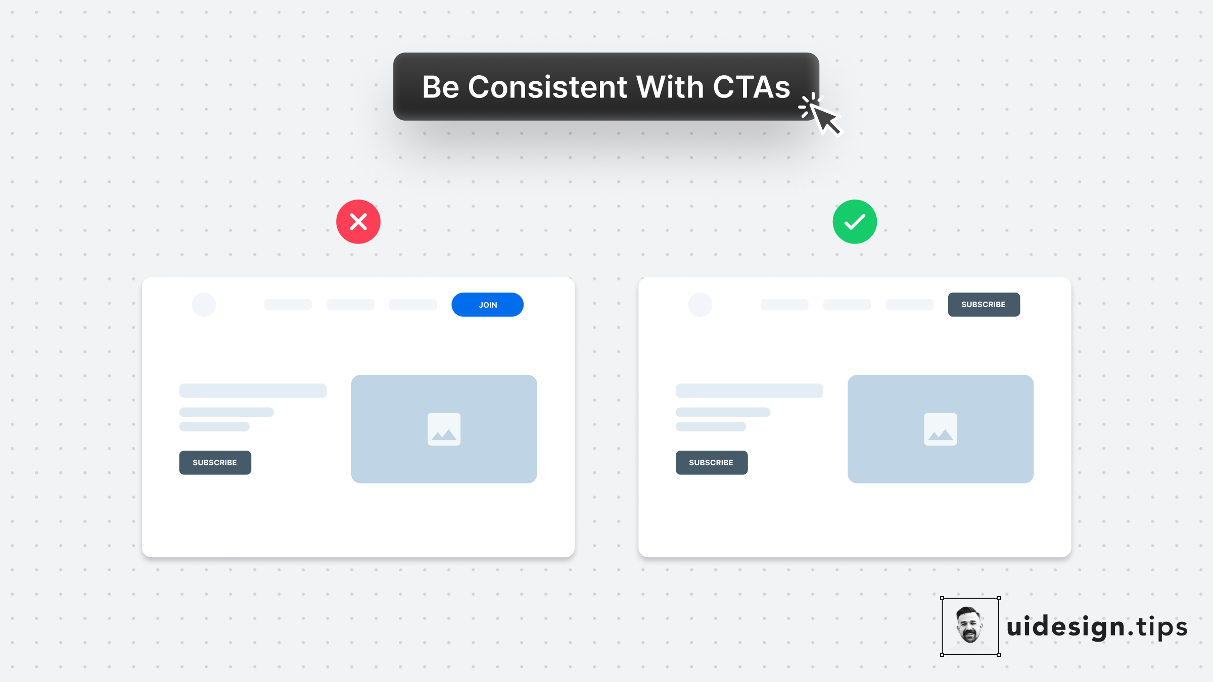
Your design, and mostly your buttons, need to be consistent thought the user interface. Keep this in mind especially for the header (hero) section. Don't confuse your visitors with different buttons in styles and copy. For almost all cases, you only need **a single primary CTA** for your top screen.
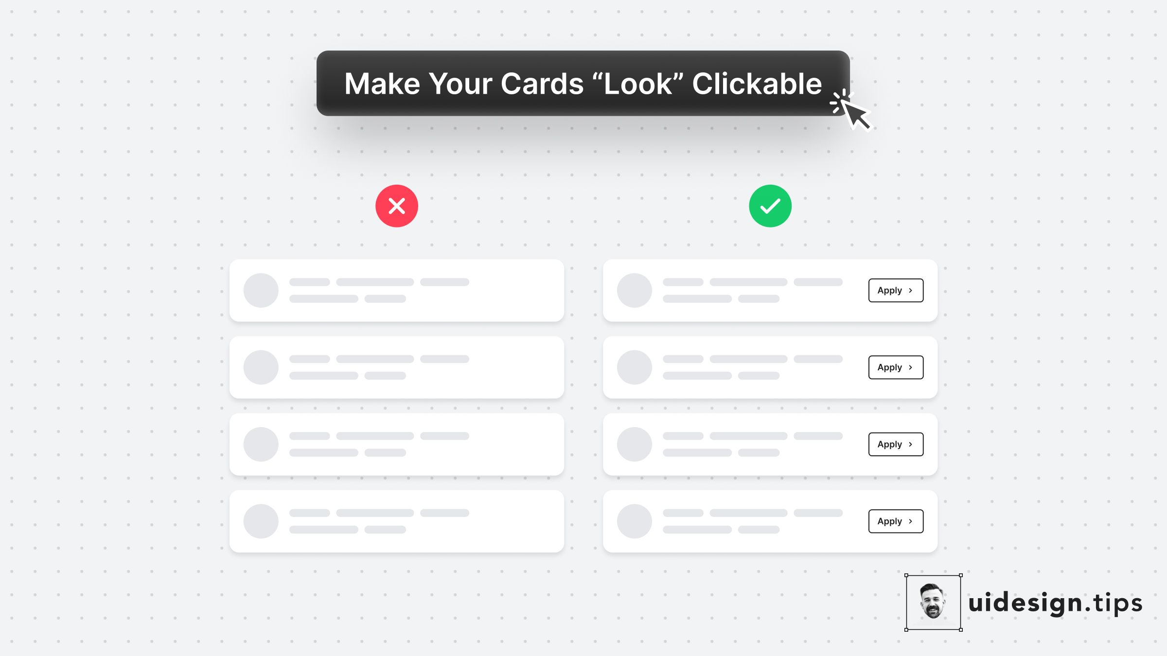
In many cases, cards fail to indicate that they're clickable. Designers omit CTA buttons and only count on the user's experience or/and, hover effects. **In design, it's always a good practice to never leave things on user imagination.** Instead use an actionable button to prompt clickability and describe the action.
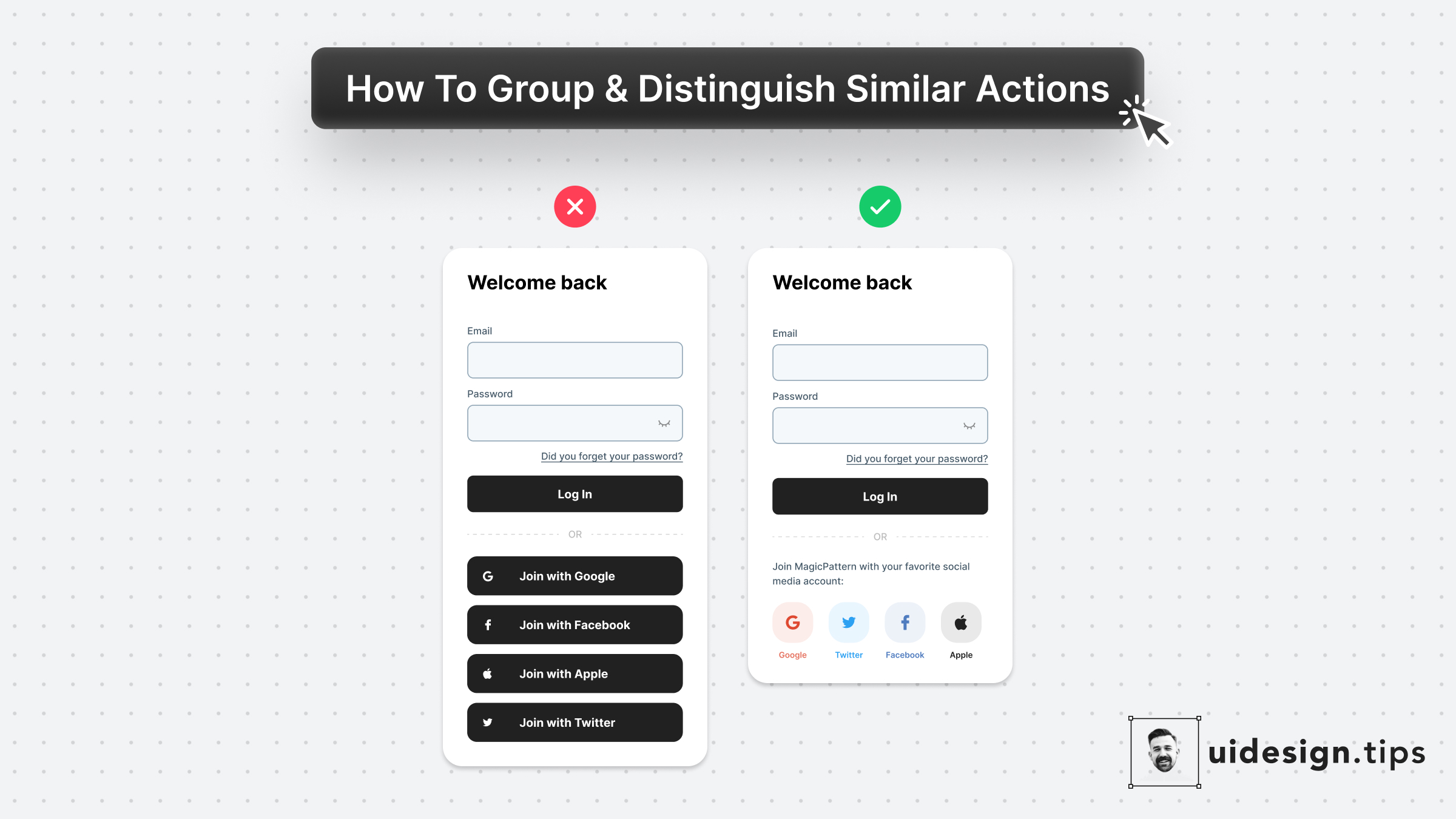
Visually distinguish elements by applying unique shapes, colors, copies, and/or icons. In that way, you ensure that visual hierarchy works perfectly and you avoid accessibility issues. To boost the strength of the visual effect use multiple attributes (color + icon) and not a single one (only color). The latter helps you avoid accessibility issues as well. Color blind people won't notice the color changes.