UI Tips
UX Tips
Articles
Newsletter
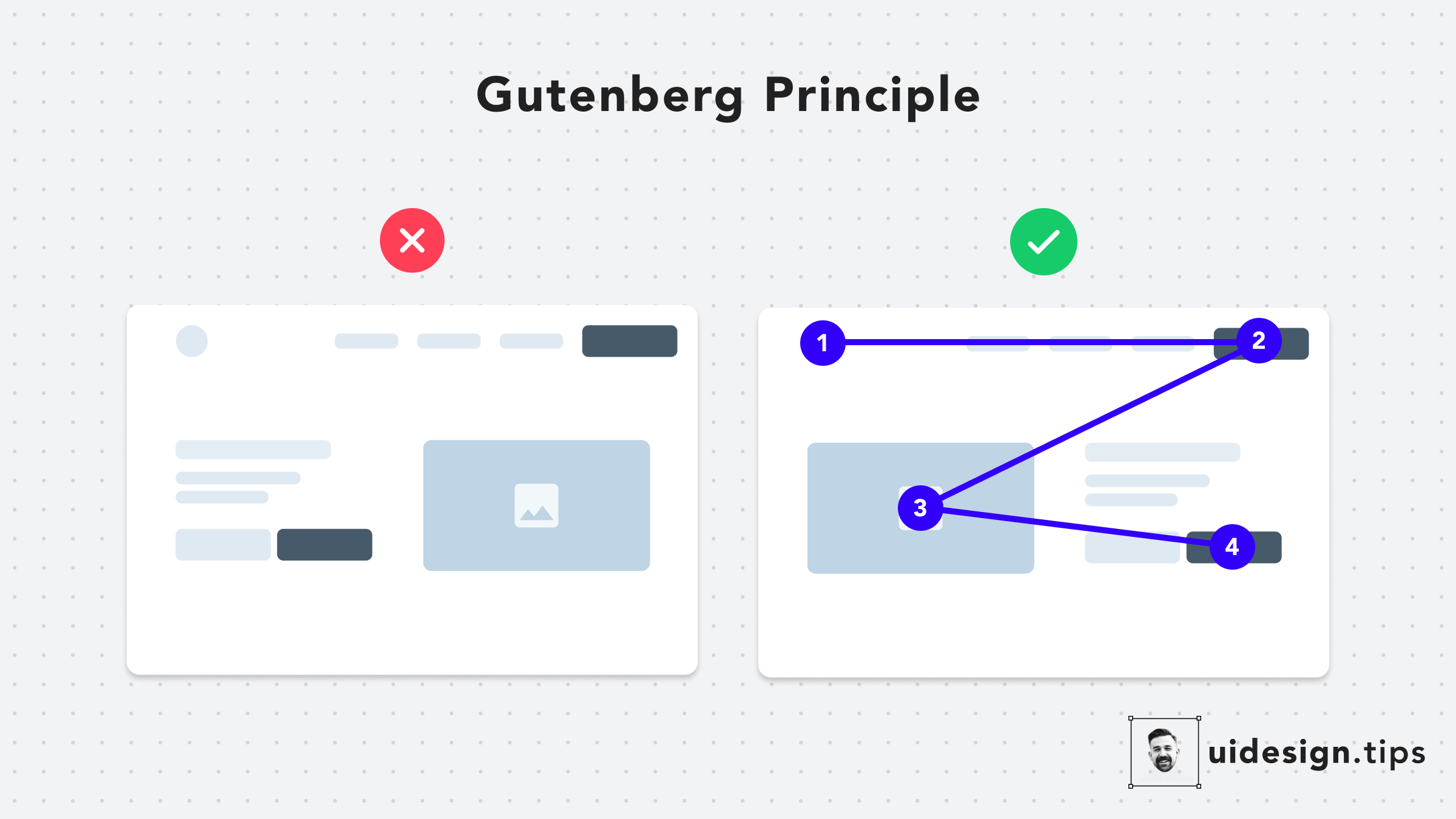
## What is The Gutenberg Principle or Z-pattern layout in UI design? The Gutenberg Principle (aka Z-Pattern Layout) states that users' eyes travel according to a Z-shaped path from the top-left area to the bottom-right area. ## How the Gutenberg Principle can help us It's a good practice to place your CTA at the end of this flow to lead users to take action.
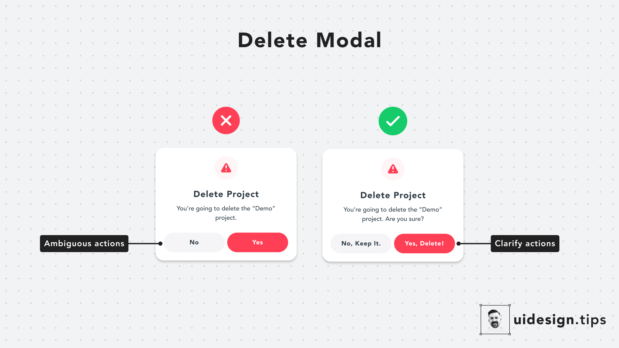
Pay extra attention to your buttons' copies. Avoid generic out-of-context copies, like 'Yes' or 'No'. Instead, use a sentence to communicate clearly the button's actions.
Never let users guess what's the next step on your user journey. Have in mind that conversions might be low because people are afraid to press a button. A strong message (like "Reserve") adds stress and makes people wonder whether they'll be charged or not.
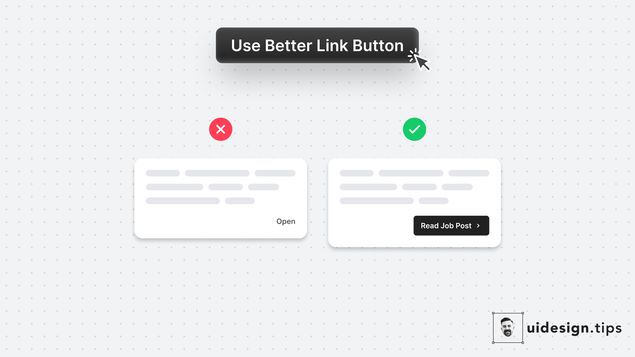
Links are important and you need to treat their appearance nicely. Many times a traditional button works better than a single link. Especially if the link is not on a header, footer, or the body of an article. Always make the copy actionable and hint at the action they initiate.
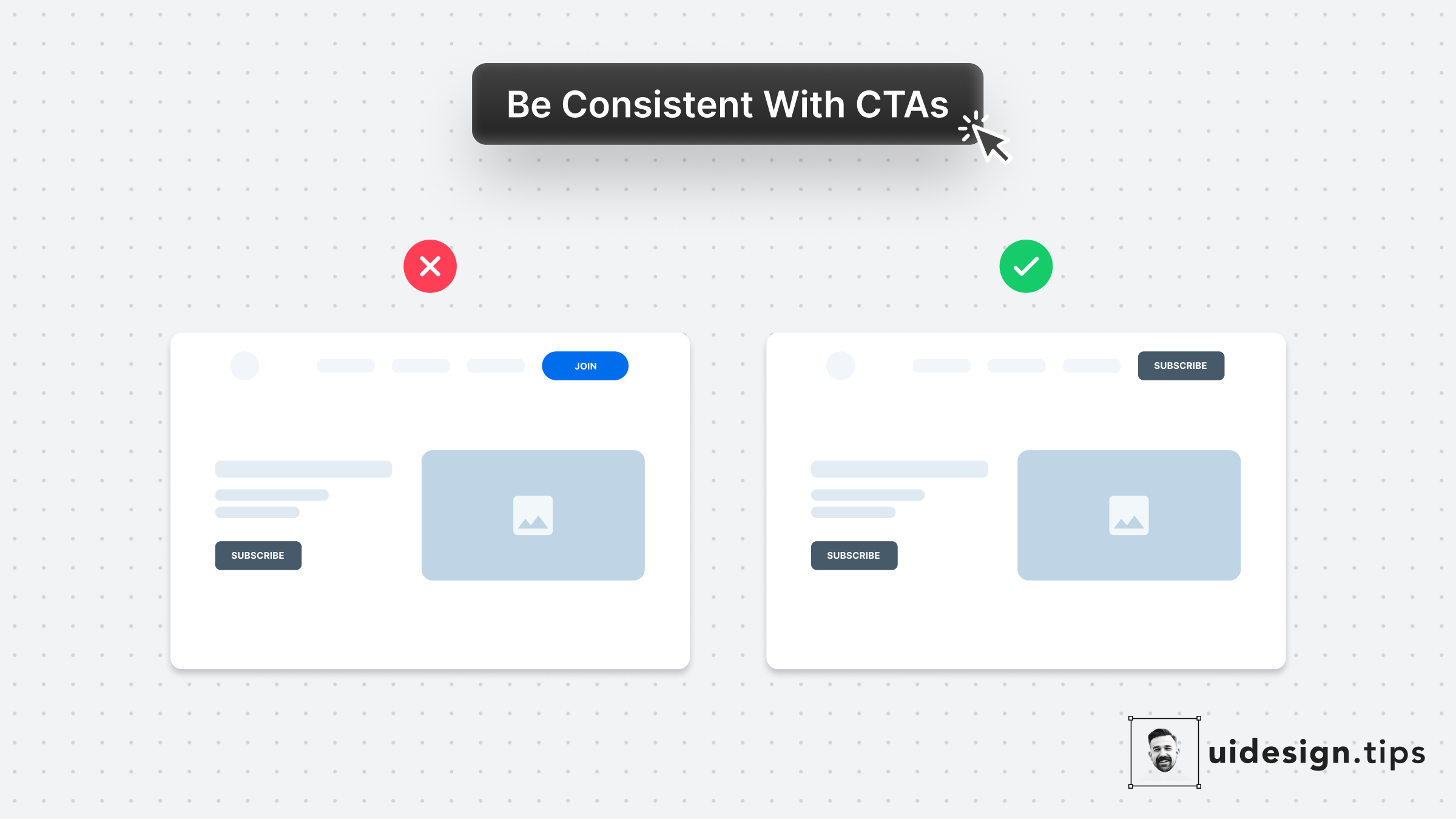
Your design, and mostly your buttons, need to be consistent thought the user interface. Keep this in mind especially for the header (hero) section. Don't confuse your visitors with different buttons in styles and copy. For almost all cases, you only need **a single primary CTA** for your top screen.
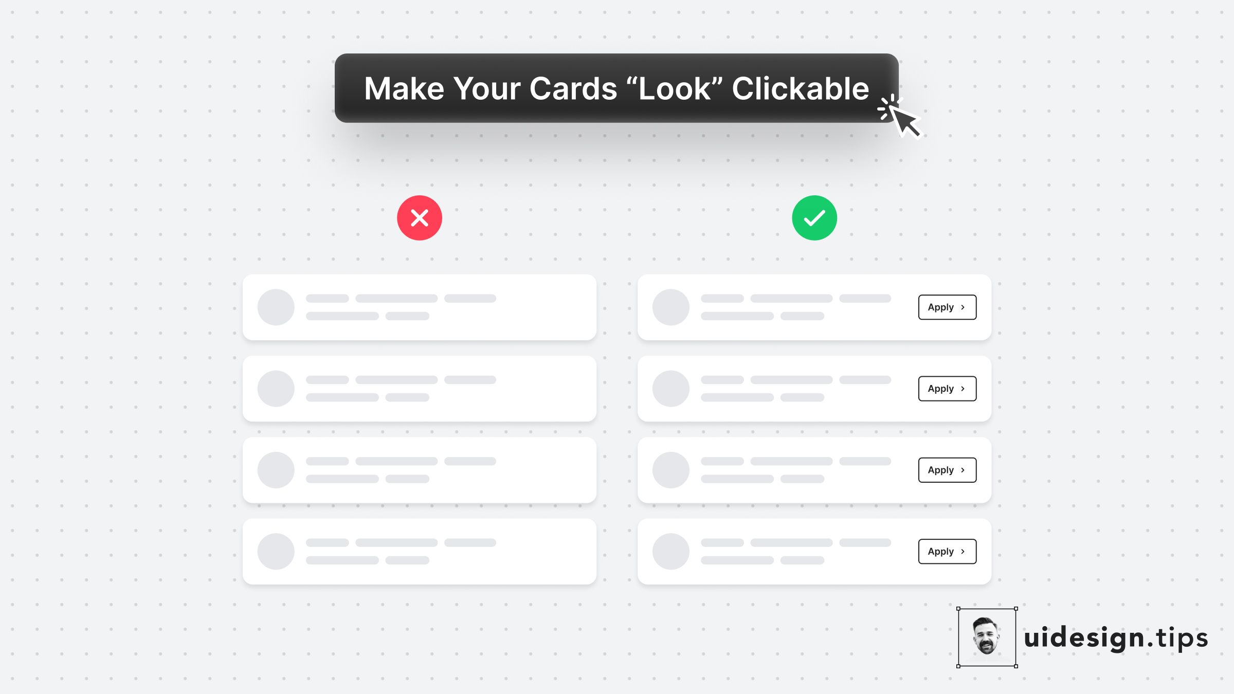
In many cases, cards fail to indicate that they're clickable. Designers omit CTA buttons and only count on the user's experience or/and, hover effects. **In design, it's always a good practice to never leave things on user imagination.** Instead use an actionable button to prompt clickability and describe the action.
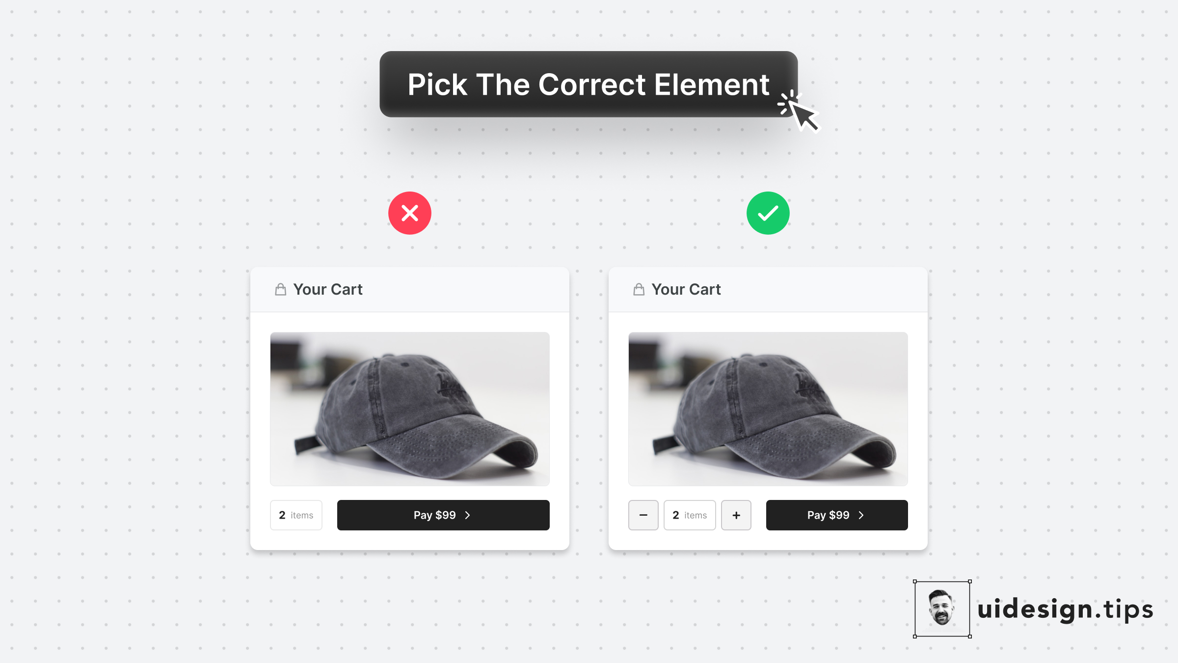
Make it as simple as possible for users to enter their information.⠀ ⠀ Choosing the right UI element plays a huge part in upgrading UX.⠀ ⠀ For example, use a number picker for integer numeric values instead of a generic text field. In eCommerce carts, most users will buy 1, or 2 items maximum. The -/+ buttons make their input process quicker.
Visual hierarchy is important in design because it boosts the user experience and leads the user attention Your No.1 priority is to make your primary action (aka CTA) prominent. In this case, the button that initiates the booking process is the main CTA. Then you need to make text readable & distinguish element types. eg. Tags must not look like the primary button. Play with text attributes (weight, size, line height) to hack visual attention & hierarchy.
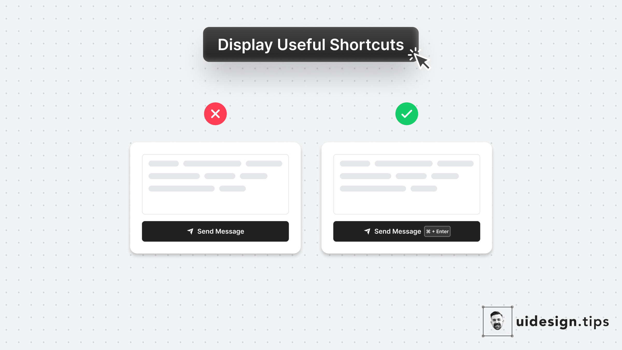
Keyboard shortcuts boost productivity and save time for power users. Yet it's sometimes difficult to remember them. Take advantage of Fitts's law* and place your shortcut keys next to the action button. In that way, the user doesn't need to remember the action. *The time to acquire a target is a function of the distance to and size of the target.
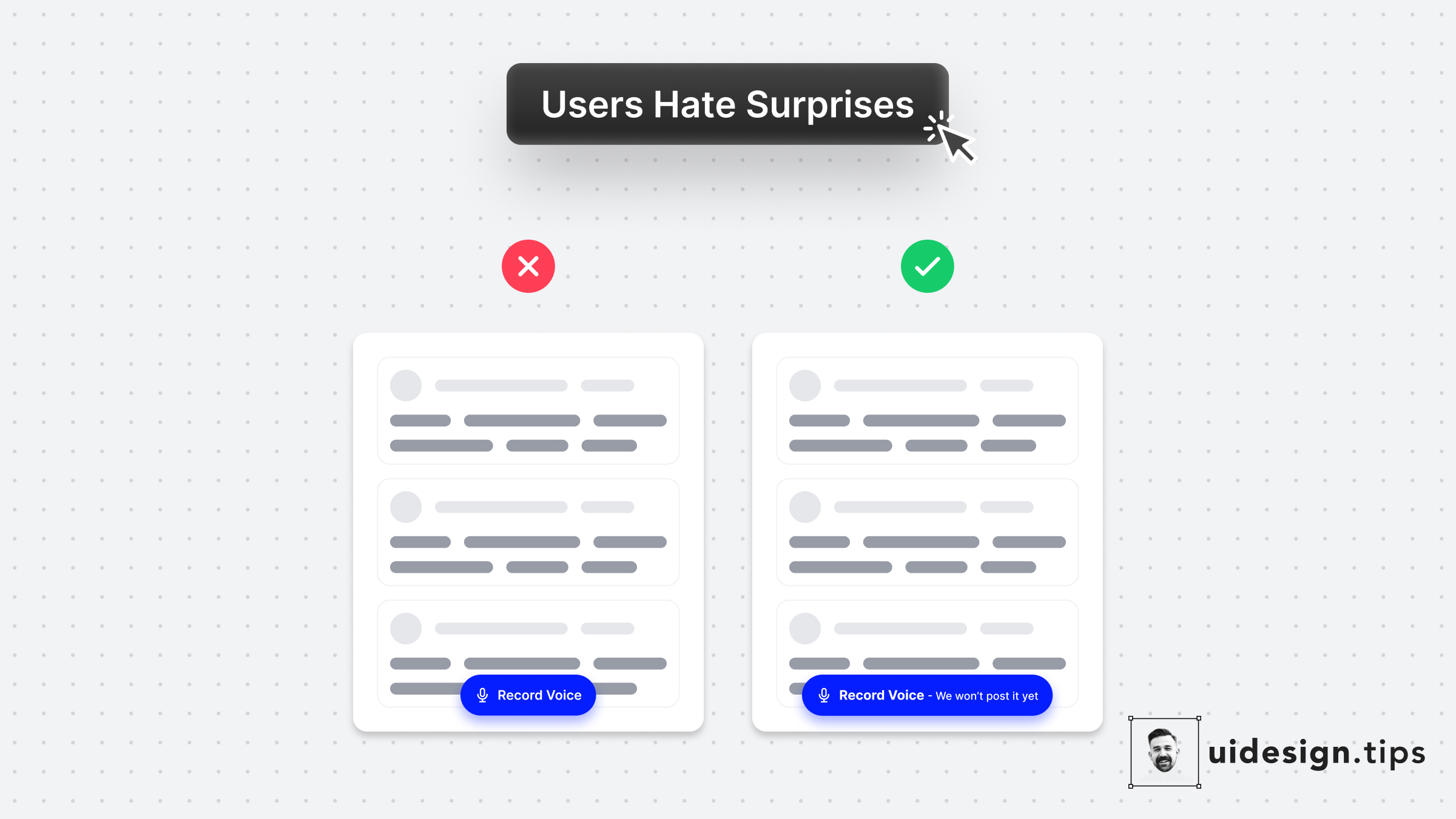
With a simple UX copy adjustment, you can avoid misunderstandings and upgrade your product experience.⠀ ⠀ This is a real-life example from the voice messaging app [Yac](https://www.yac.com/).⠀ ⠀ I literally spend 30' wondering if the app will auto-post my voice message in the channel or allow me to hear and edit it first.⠀ ⠀ In the end, I recorded it on my phone and hit the "Record" button with the recorded message ⠀ A tiny detail can introduce so much friction!⠀