
UI Design Tips by Jim Raptis
Learn how to design better user interfaces and make your users happier with these simple UI tips. All the tips are tested in real-life products!!!
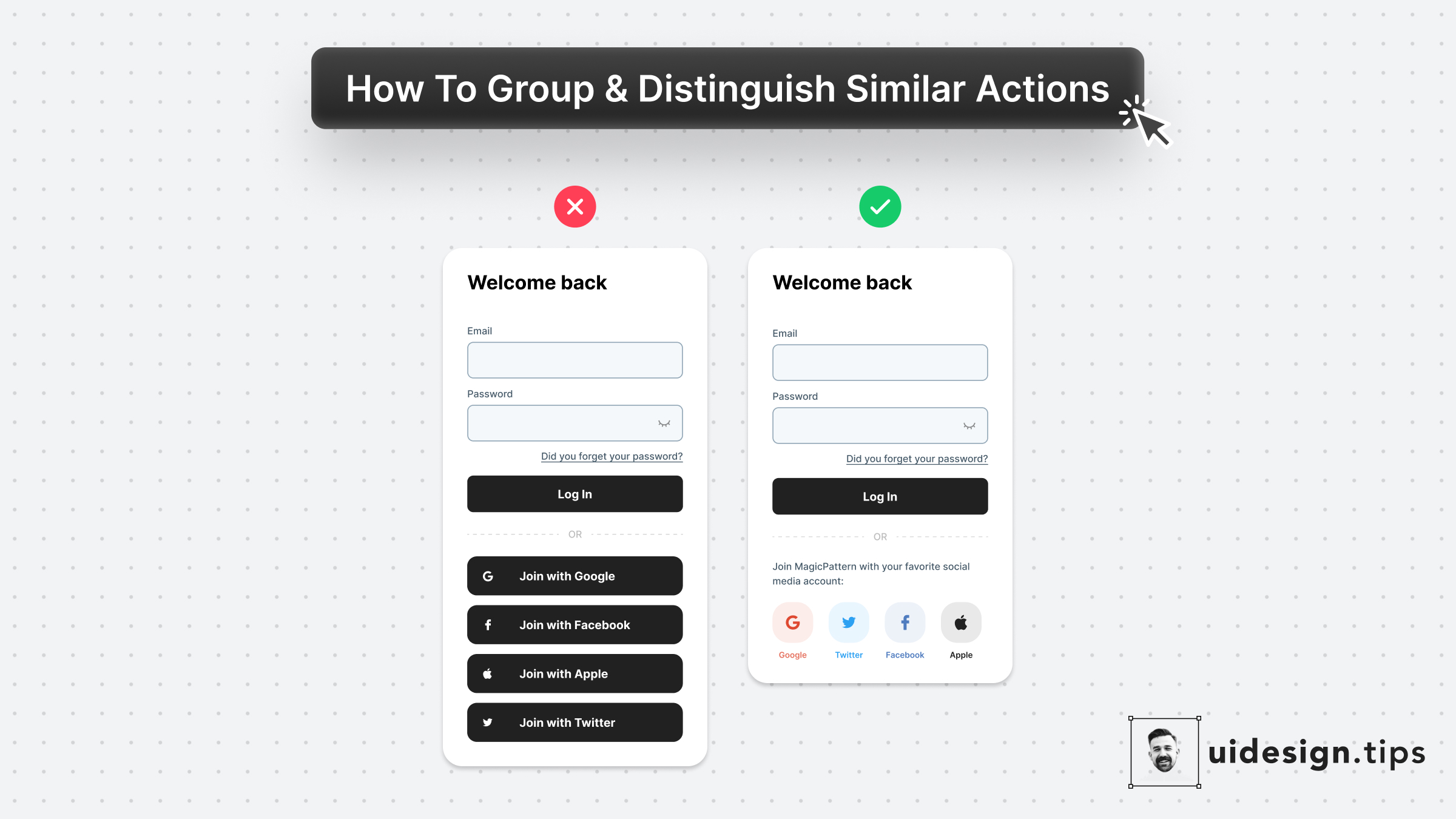
Social Login
Social login boosts conversion since users can easily join your platform. Then, it's a good practice to put your social login on top of the page and place the email password authentication below. Beware that privacy-oriented people prefer not to use social login then it's always good to have another option for them.
uxloginauth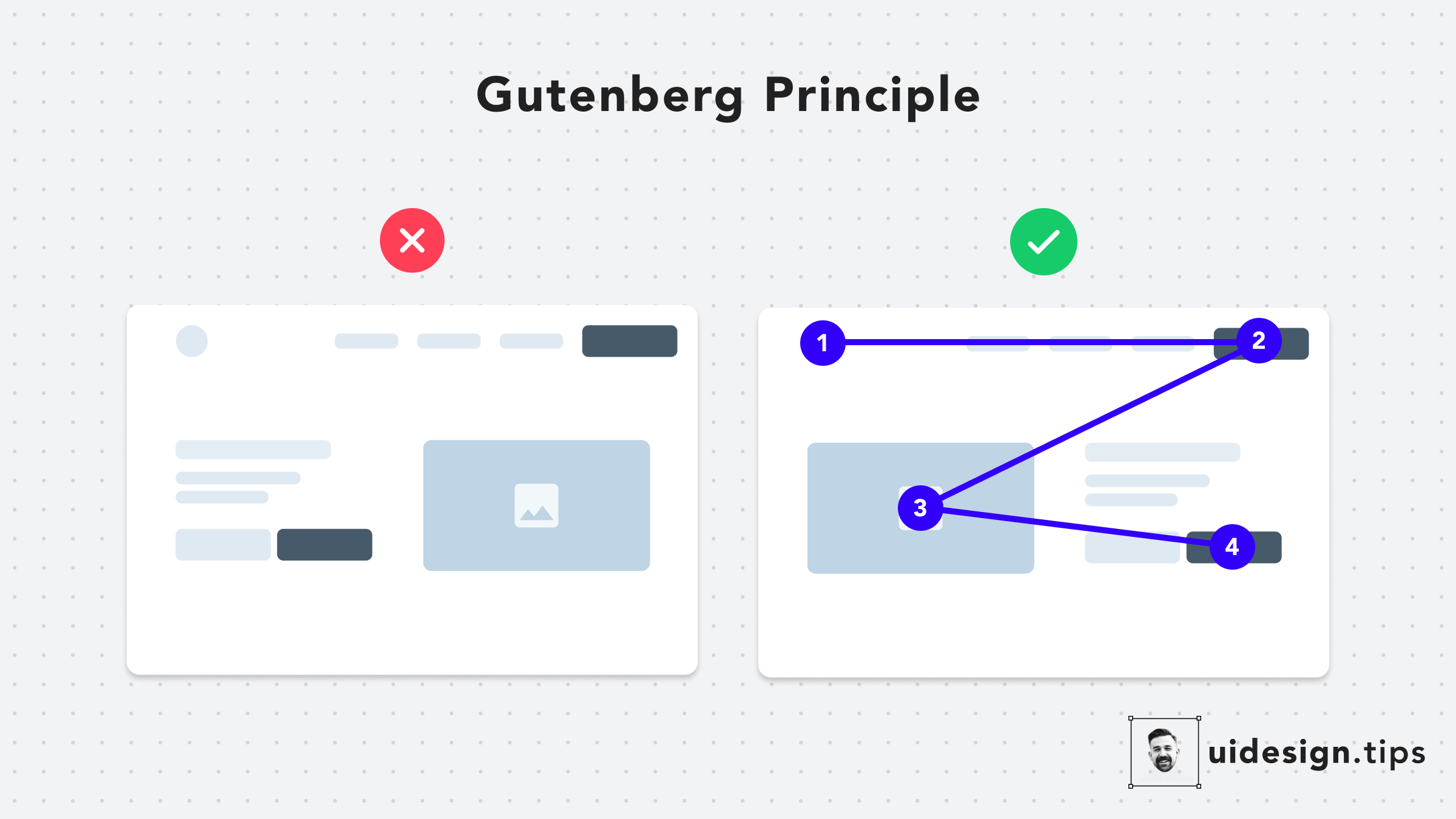
The Gutenberg Principle
## What is The Gutenberg Principle or Z-pattern layout in UI design? The Gutenberg Principle (aka Z-Pattern Layout) states that users' eyes travel according to a Z-shaped path from the top-left area to the bottom-right area. ## How the Gutenberg Principle can help us It's a good practice to place your CTA at the end of this flow to lead users to take action.
ctauxux-laws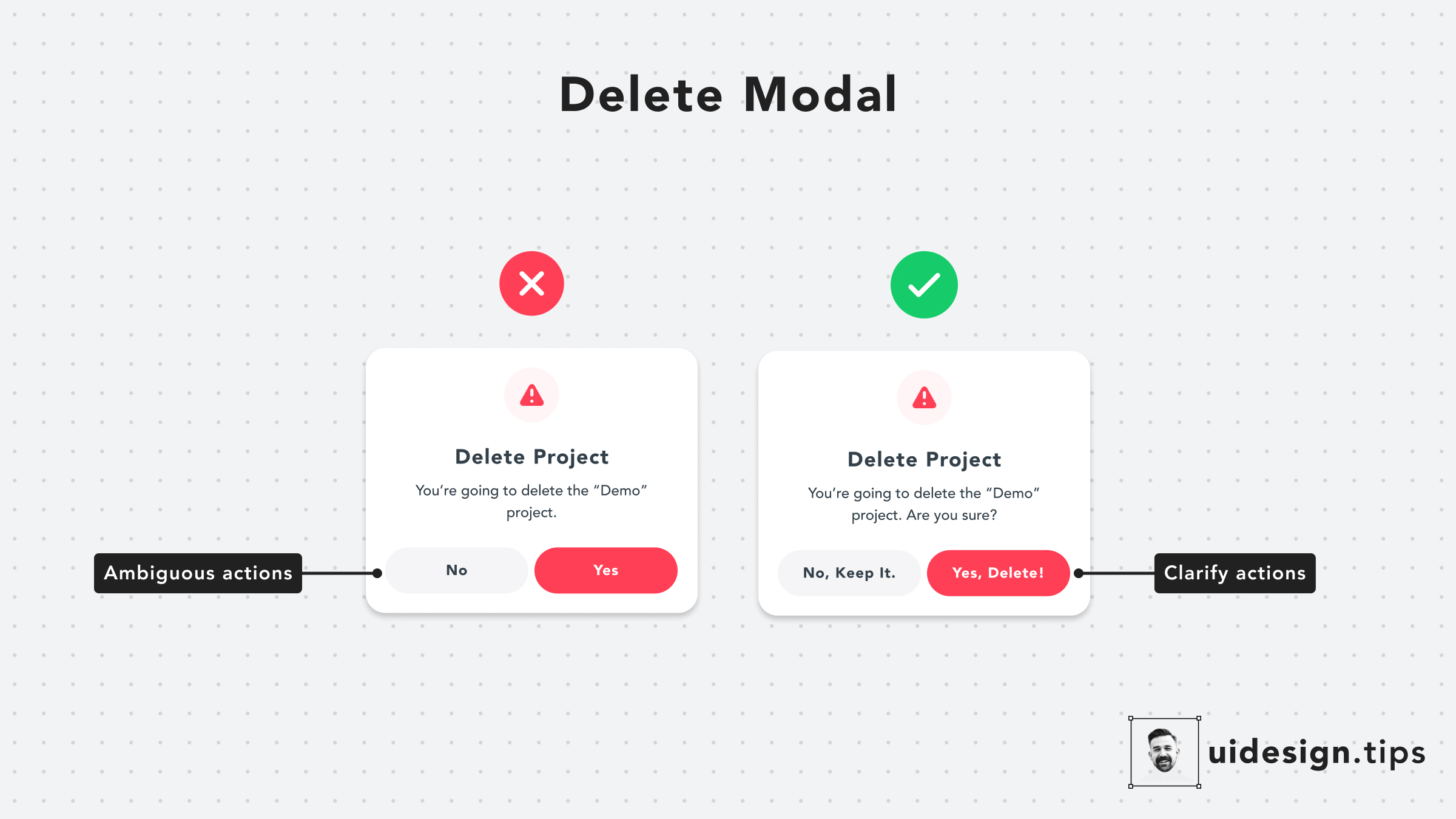
Delete Modal
Pay extra attention to your buttons' copies. Avoid generic out-of-context copies, like 'Yes' or 'No'. Instead, use a sentence to communicate clearly the button's actions.
ctadangerous actionsux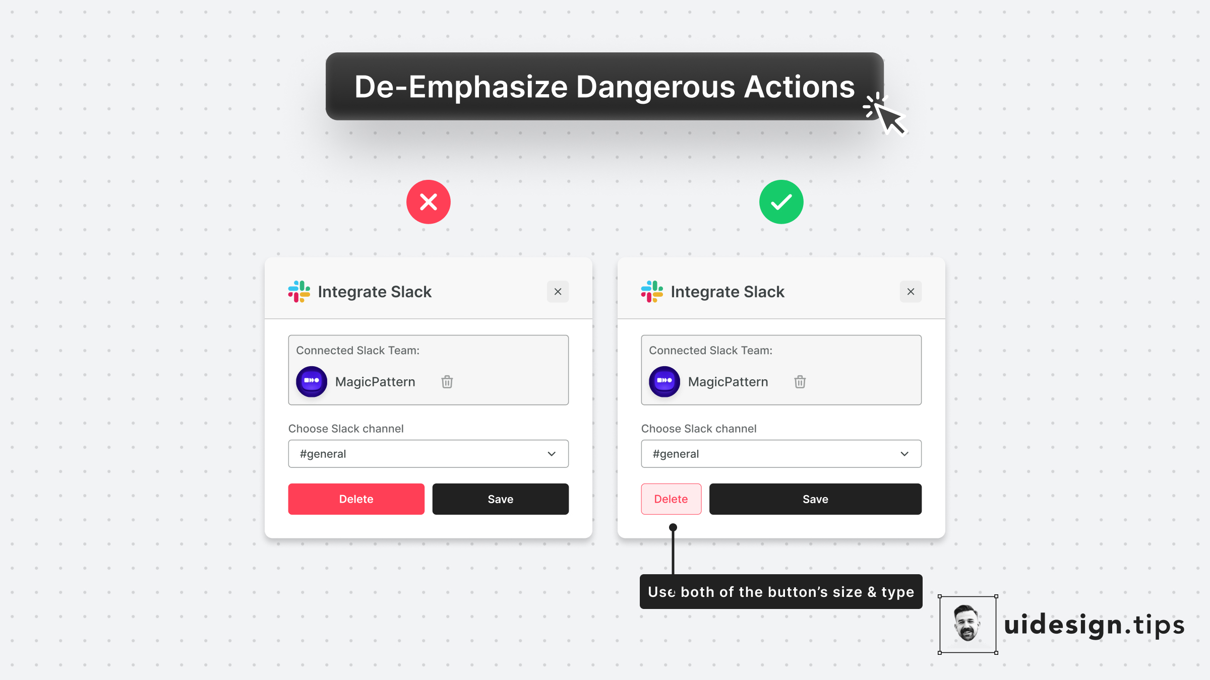
De-emphasize Dangerous Actions
Always try to de-emphasize dangerous actions like deletion. You have to prioritize the default action instead of the dangerous/irreversible one. Also, use more than one trait to make the element look like a secondary action (color, size, type, placement, etc).
uiuxvisual effectdangerous actions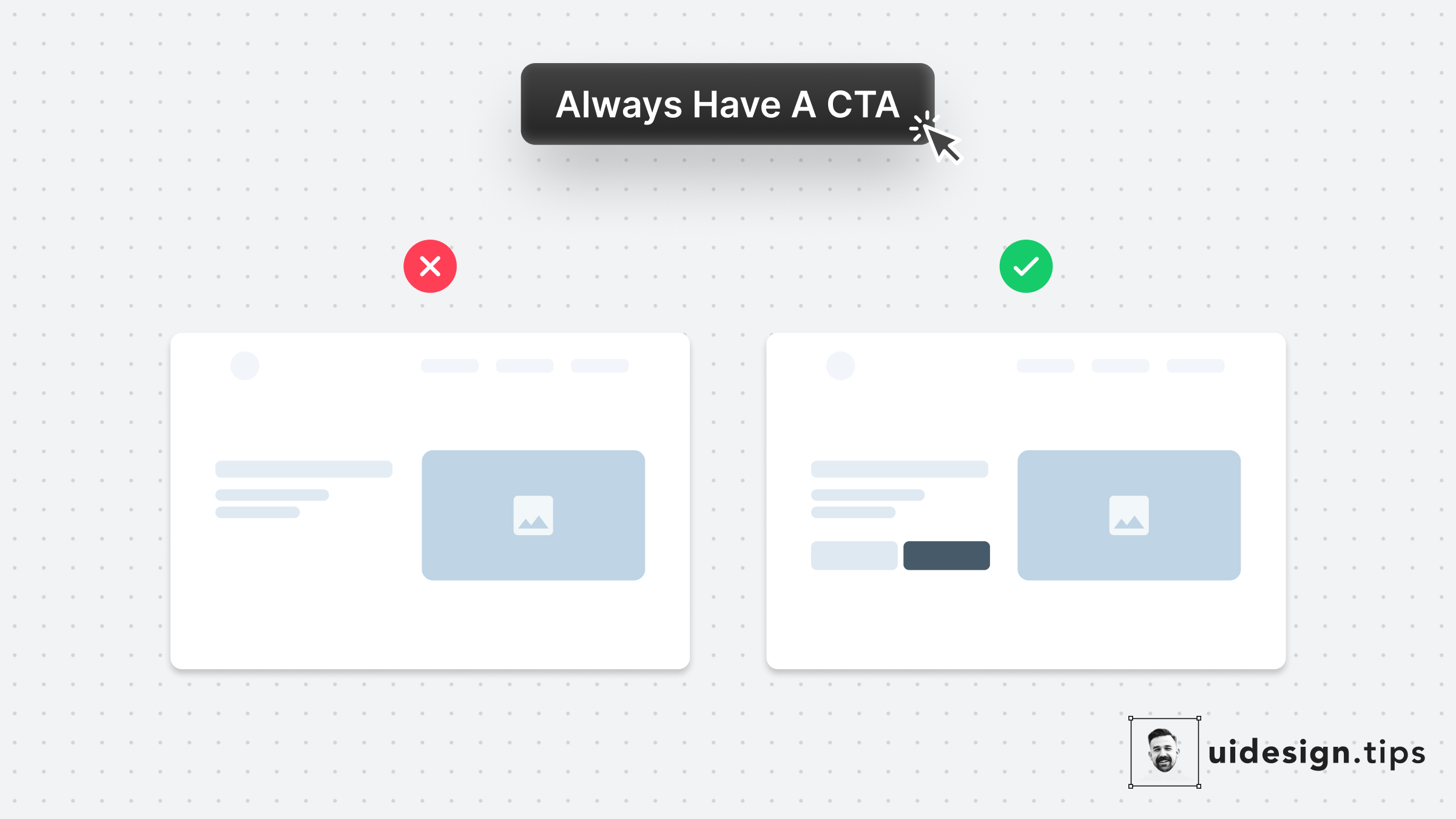
Always Have A CTA
Always have a CTA button on your website's above the fold section Many of your visitors might never scroll down your landing page So you need to offer them an option to convert immediately.
uxconversions
The Perfect Header
A good header needs to put attention on the title and then lead the reader to the description, which must be readable. A few quick hacks to achieve this hierarchy include: 1. Stronger font-weight for the title 2. A consistent type scale system. The most common is x1.25, which means that if the title is 40px, the subtitle must be 40/1.25 = 32px. 3. Lower contrast for the subtitle 4. Proper line-height for the description text. 5. Left alignment, since it boosts readability
hierarchyuiuxvisual effectheader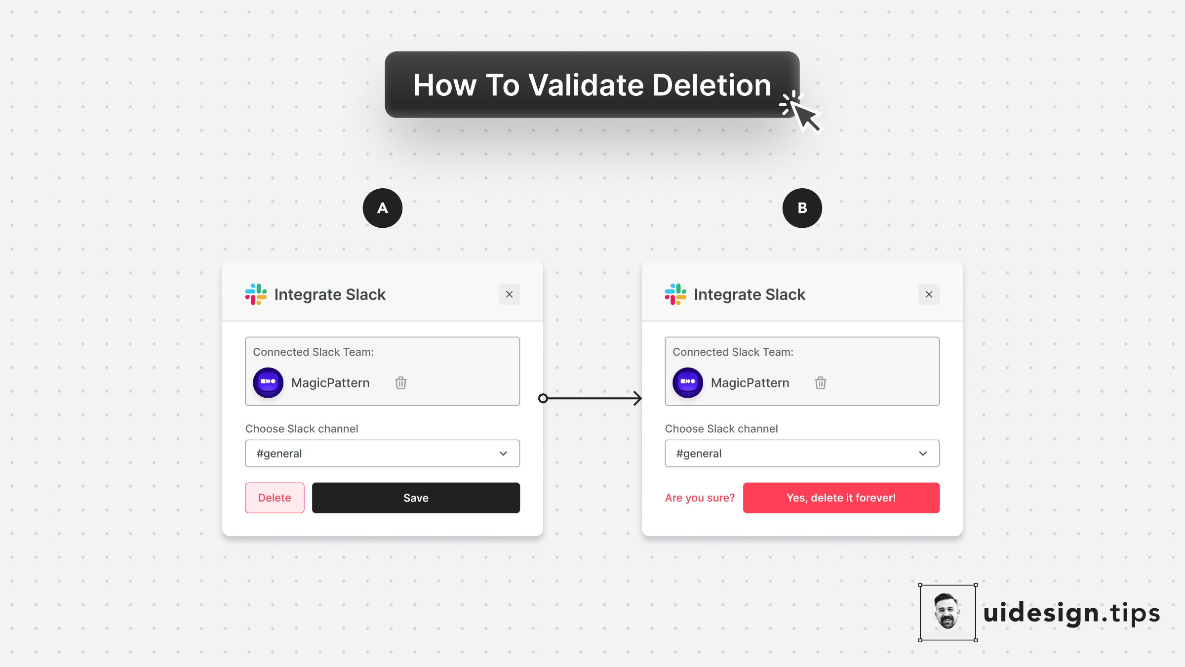
Validate Deletion
Never allow the user to delete something without validation. People misclick all the time, and losing information forever hurts and creates a bad memory related to your product! Make sure your UI supports (inline or popup) deletion validation. Even the undo functionality is useful in these scenarios, although it's impossible sometimes due to engineering restrictions.
dangerous actionsux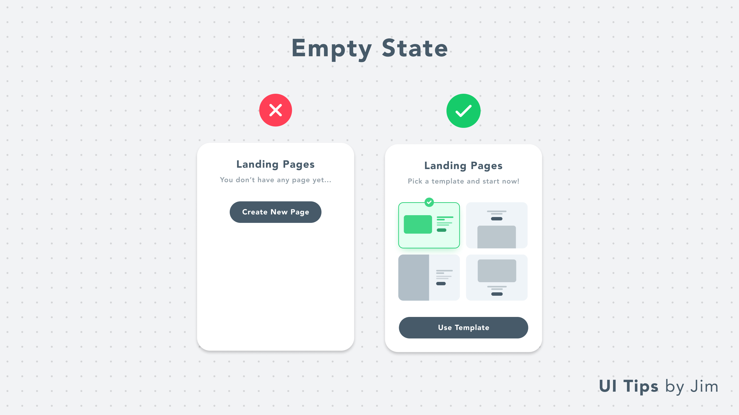
Empty State With Templates
Upgrade your UI empty states with templates! Instead of redirecting people to create content from scratch, make their lives easier. Use pre-made templates to help them experience your product's value quicker and boost your product adoption at the same time.
on-boardingux
Inform Users Beforehand
Never let users guess what's the next step on your user journey. Have in mind that conversions might be low because people are afraid to press a button. A strong message (like "Reserve") adds stress and makes people wonder whether they'll be charged or not.
uxon-boardingcta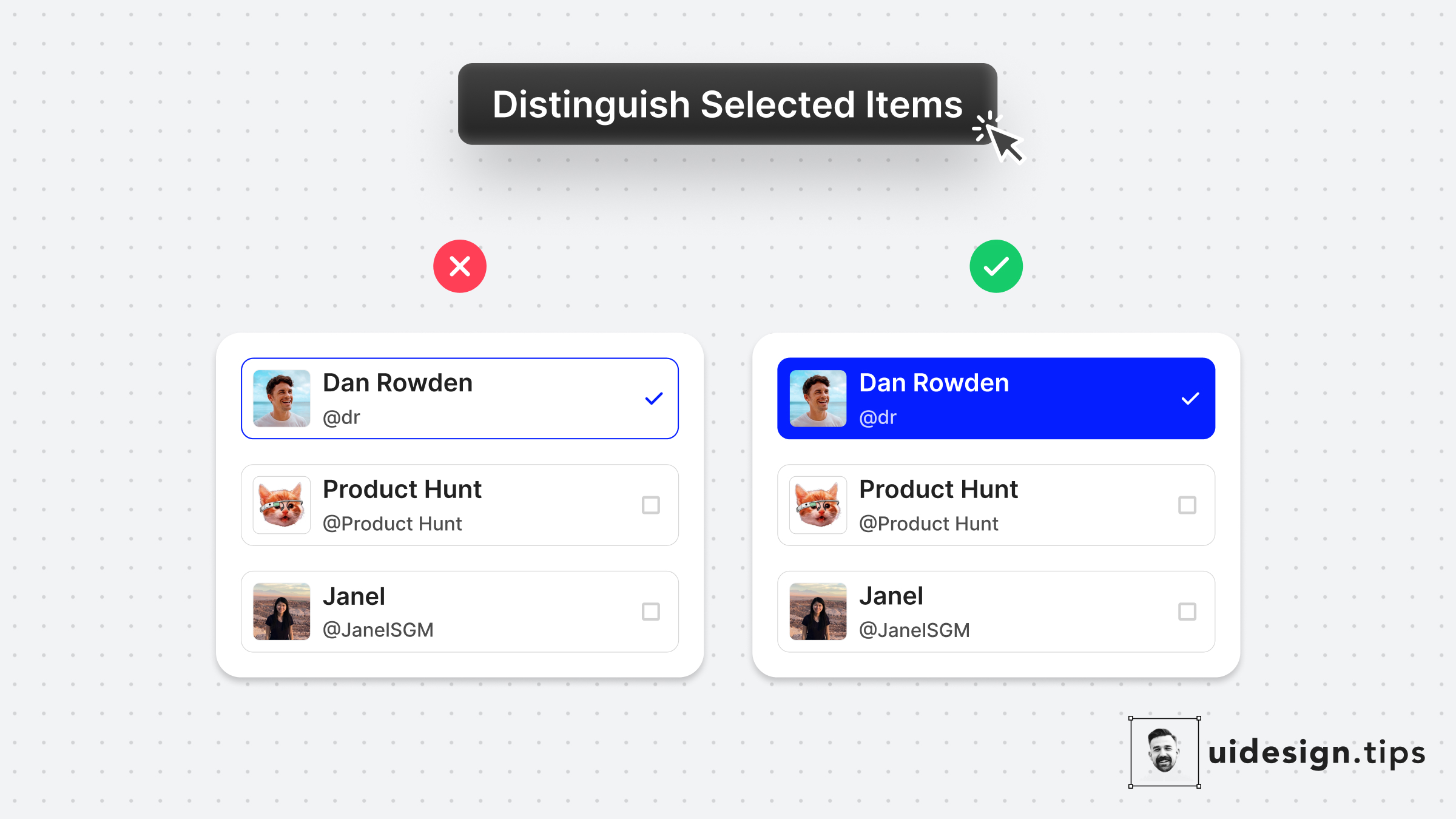
Distinguish Selected Items
Always make sure that your selected items are easily identified at a glance. Changing the background color is a simple and accessible way to achieve it! It makes the user experience better since the user can easily figure out which elements are already selected.
uxuivisual effecthierarchy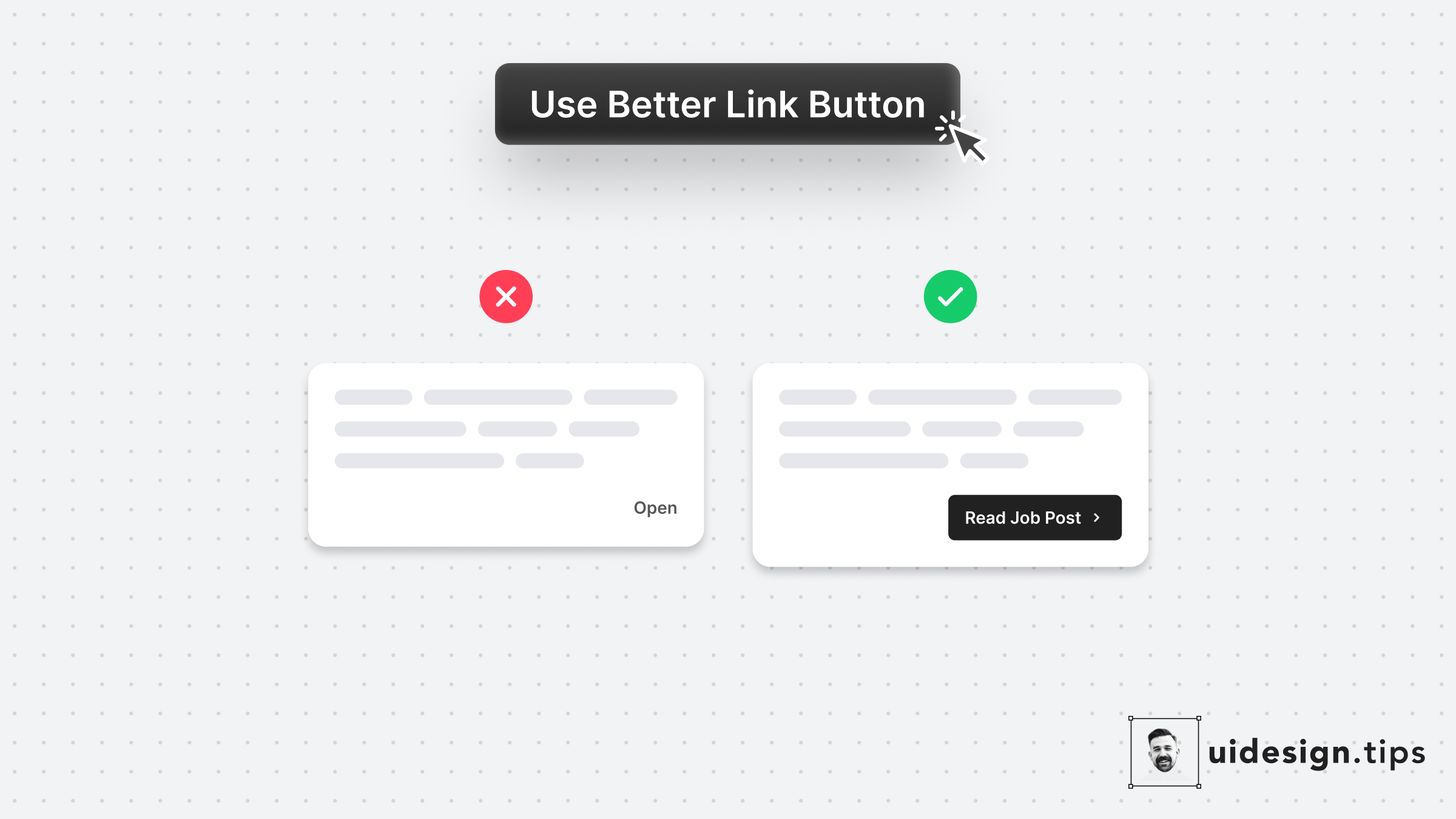
Use Better Link Button
Links are important and you need to treat their appearance nicely. Many times a traditional button works better than a single link. Especially if the link is not on a header, footer, or the body of an article. Always make the copy actionable and hint at the action they initiate.
buttonctauxui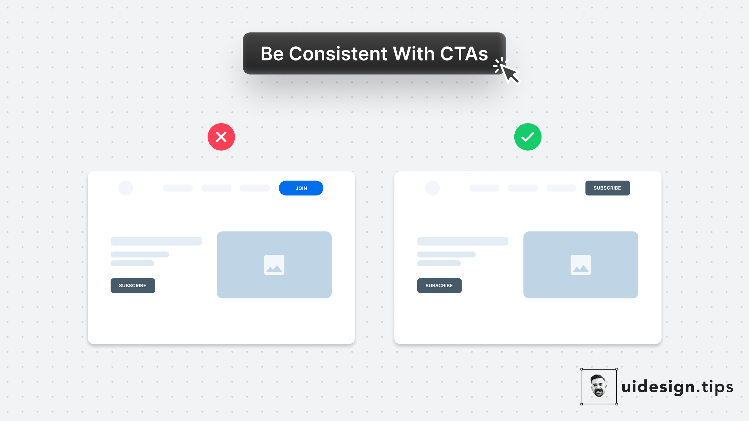
Use Consistent Buttons
Your design, and mostly your buttons, need to be consistent thought the user interface. Keep this in mind especially for the header (hero) section. Don't confuse your visitors with different buttons in styles and copy. For almost all cases, you only need **a single primary CTA** for your top screen.
buttonctauxuiconversions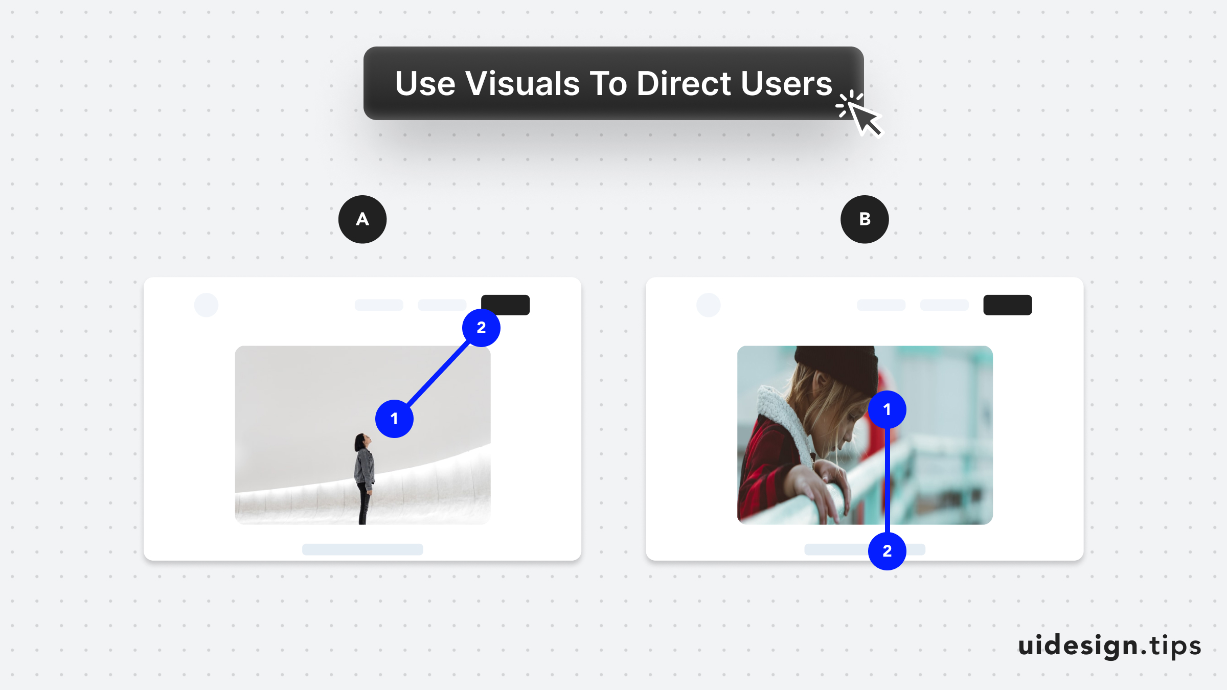
Direct User Attention with Media
Leverage visuals to direct user's attention As humans, we tend to follow another person's line of sight. Take advantage of this effect, by prompting people to focus on individual elements (A) or scroll (B).
attentionuxconversionsvisual effect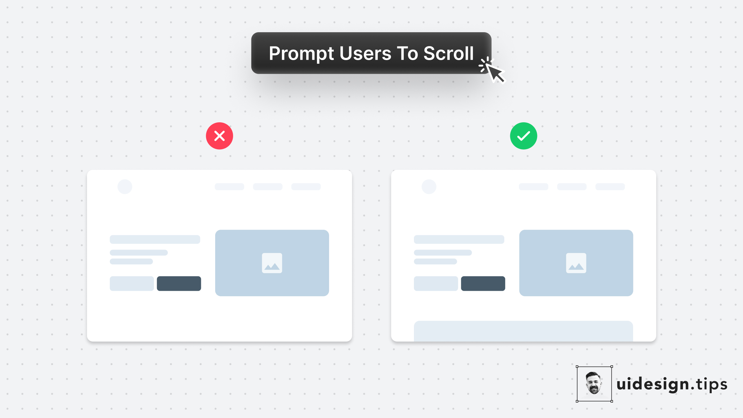
Prompt User to Scroll
Your website needs to prompt users to scroll to communicate your product's value better. Especially when the header content is not enough to describe your product's value. A simple hack to prompt users to scroll is by showing them a glimpse of the next section. In that way, the user knows there is more information on the site and becomes curious to explore it further.
landing pageconversionsuxvisual effect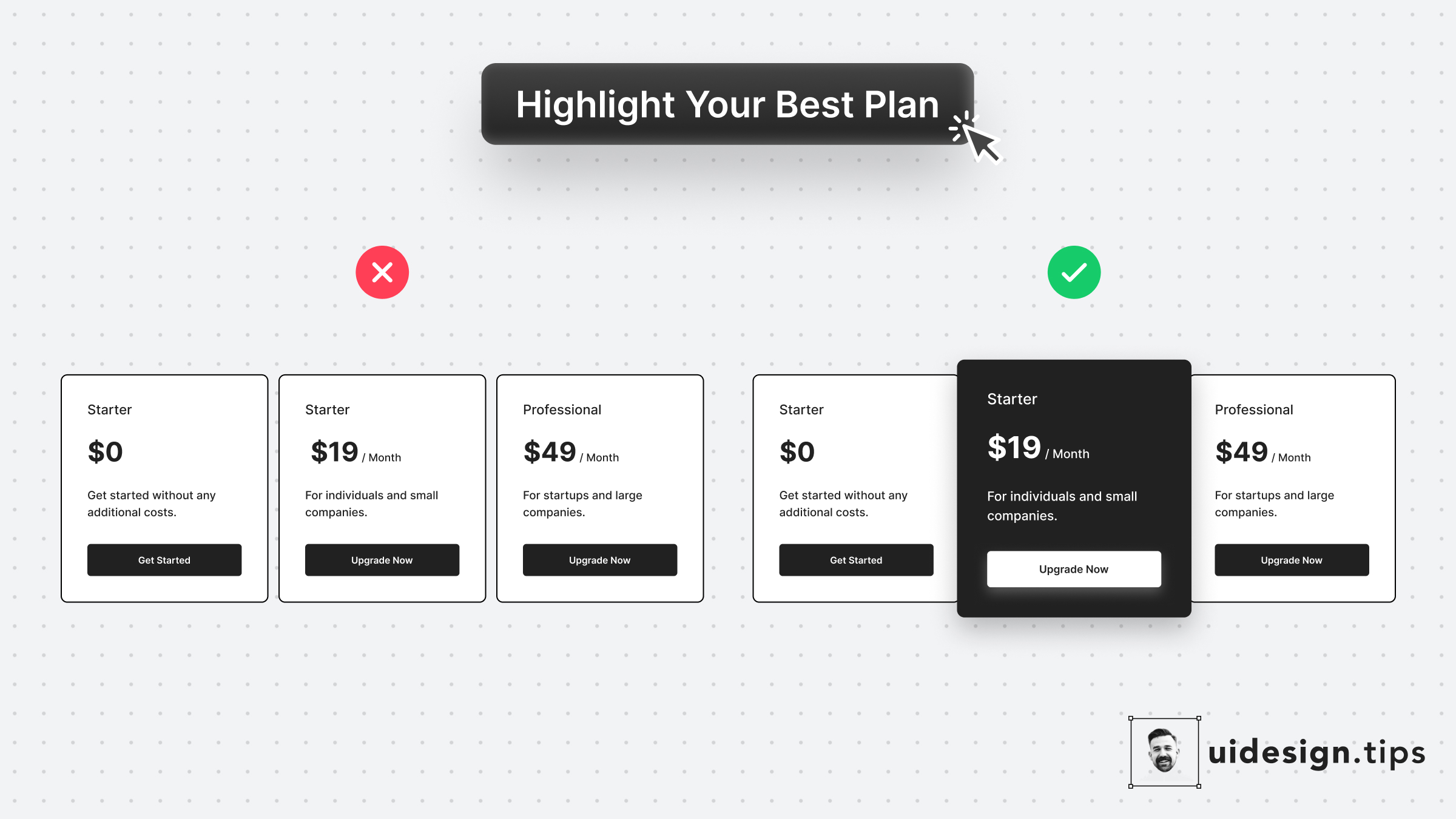
Highlight The Best Offer
Always highlight your best pricing plan and make it pop out. In that way, you help users identify the most used plan and you promote your top offer. It's a win-win situation. To highlight the plan, use more than one design ways, eg. color, size, elevation (aka shadow)!
hierarchyuxuiconversionspricing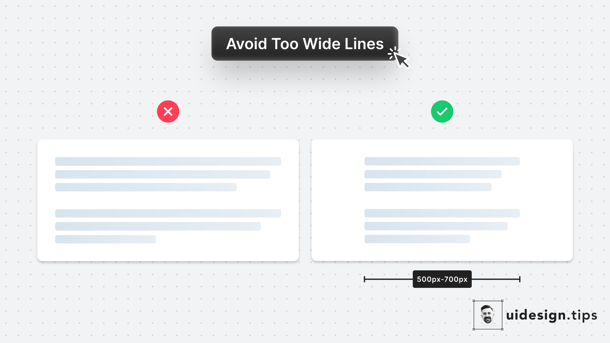
Avoid Fullwidth Paragraphs
Long lines can bore users and create readability problems. Fix it by limiting the line's width between 500px and 700px. Instead of pixels, you can restrict the character number per line as well. In CSS, it's easy to set this up by using the "ch" unit: `10ch is x10 times the width of the character 0`
textreadabilityuxui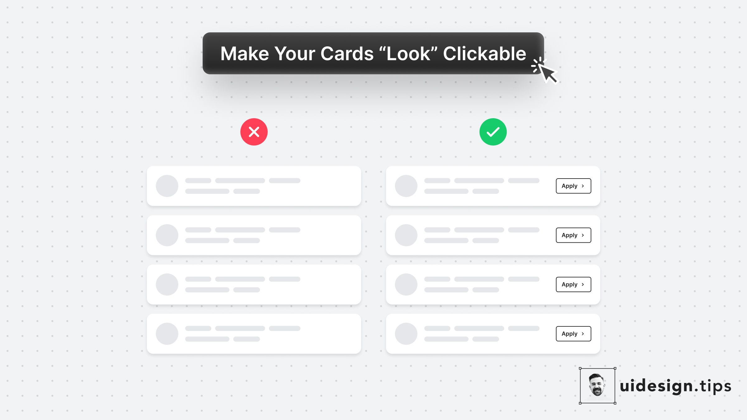
Make Cards Look Clickable
In many cases, cards fail to indicate that they're clickable. Designers omit CTA buttons and only count on the user's experience or/and, hover effects. **In design, it's always a good practice to never leave things on user imagination.** Instead use an actionable button to prompt clickability and describe the action.
ctabuttoncarduiux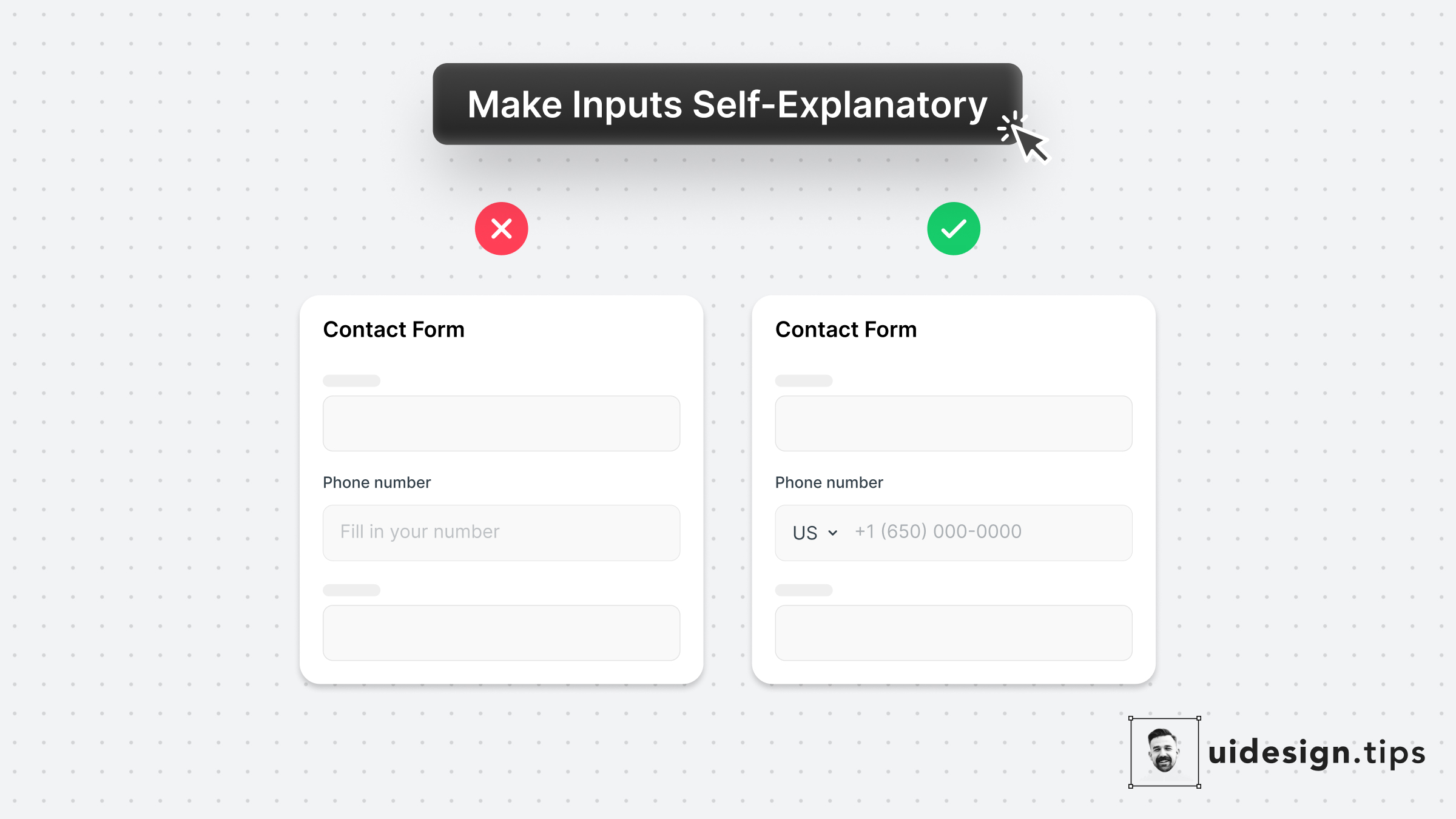
Make Inputs Self-Explanatory
The two "secret" weapons to enhance your input fields are the placeholder text & its type.⠀ ⠀ 1. Leverage the placeholder text to guide users instead of just repeating the label. ⠀ ⠀ 2. Limit the wrong input source (eg add country code) by using predefined values for common inputs.⠀
formsinputuiux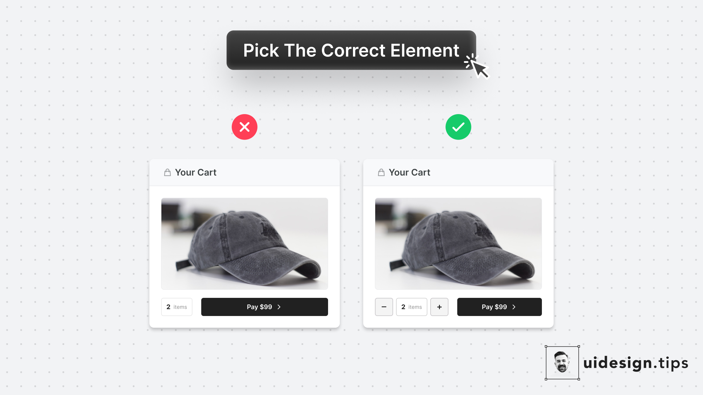
Pick The Correct Element
Make it as simple as possible for users to enter their information.⠀ ⠀ Choosing the right UI element plays a huge part in upgrading UX.⠀ ⠀ For example, use a number picker for integer numeric values instead of a generic text field. In eCommerce carts, most users will buy 1, or 2 items maximum. The -/+ buttons make their input process quicker.
conversionsformsinputctauxui
How To Enhance Hierarchy
Visual hierarchy is important in design because it boosts the user experience and leads the user attention Your No.1 priority is to make your primary action (aka CTA) prominent. In this case, the button that initiates the booking process is the main CTA. Then you need to make text readable & distinguish element types. eg. Tags must not look like the primary button. Play with text attributes (weight, size, line height) to hack visual attention & hierarchy.
visual effecthowctauxui
Make Tooltips Responsive
The classic tooltip is activated once the user hovers over the element... On desktop, this works perfectly! However mobile devices don't support the hover effect To deal with this, add a clickable help icon next to your button. When the mobile user taps on the icon, show the complementary tooltip text.
mobileuxtooltipaccessibility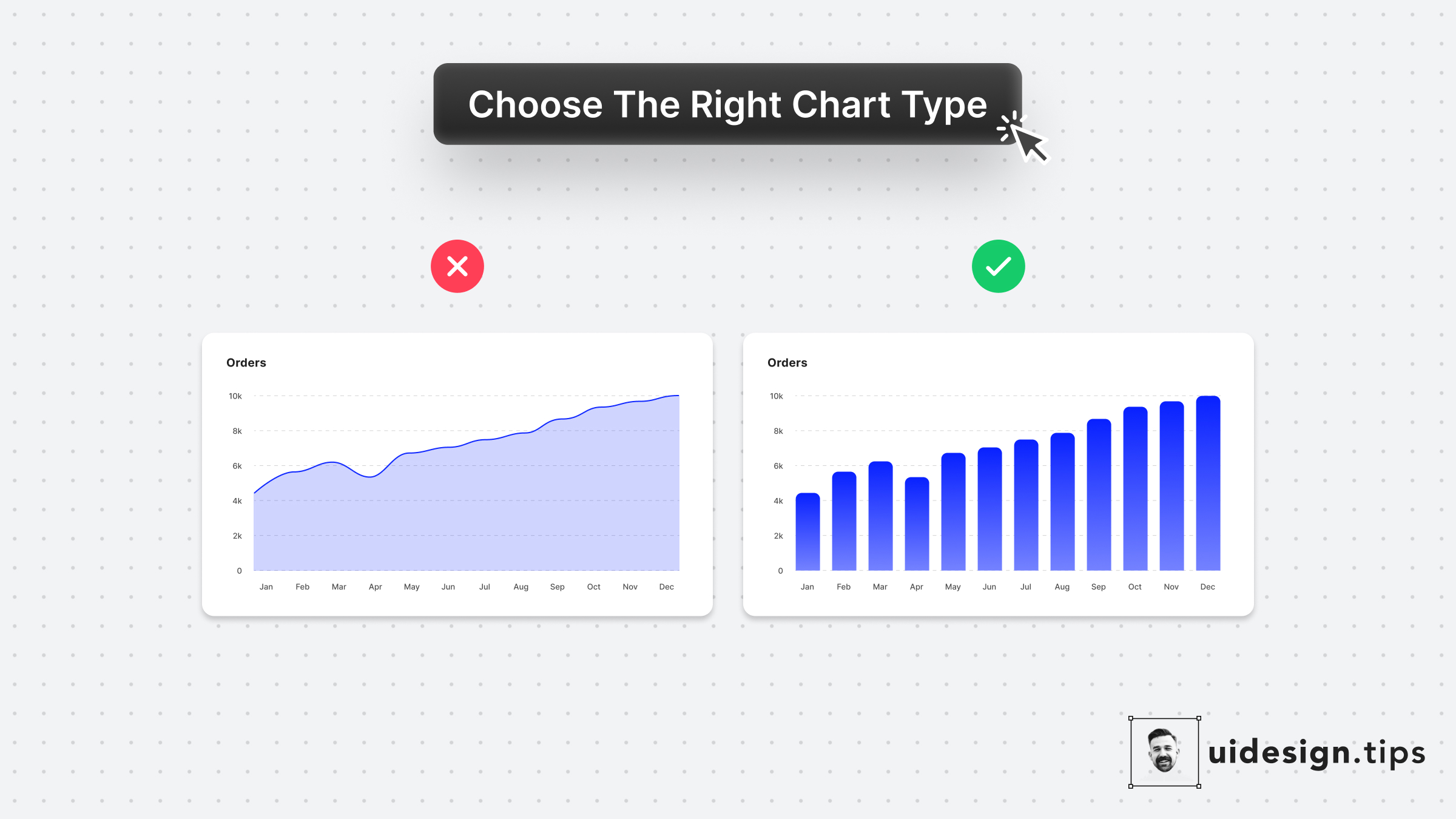
Choose Chart Types Carefully
Line charts might look trendier but they don't apply to every case. When the x-axis has limited options, a bar chart is the most appropriate graph type. Plus, the line chart might introduce false intermediate values. For the specific example, let's say that you only had data for the total monthly orders (not individual days) The line chart makes the data look daily, which is incorrect!
chartuxui
Visually Distinguish Elements
Visually distinguish elements by applying unique shapes, colors, copies, and/or icons. In that way, you ensure that visual hierarchy works perfectly and you avoid accessibility issues. To boost the strength of the visual effect use multiple attributes (color + icon) and not a single one (only color). The latter helps you avoid accessibility issues as well. Color blind people won't notice the color changes.
visual effectuiuxbutton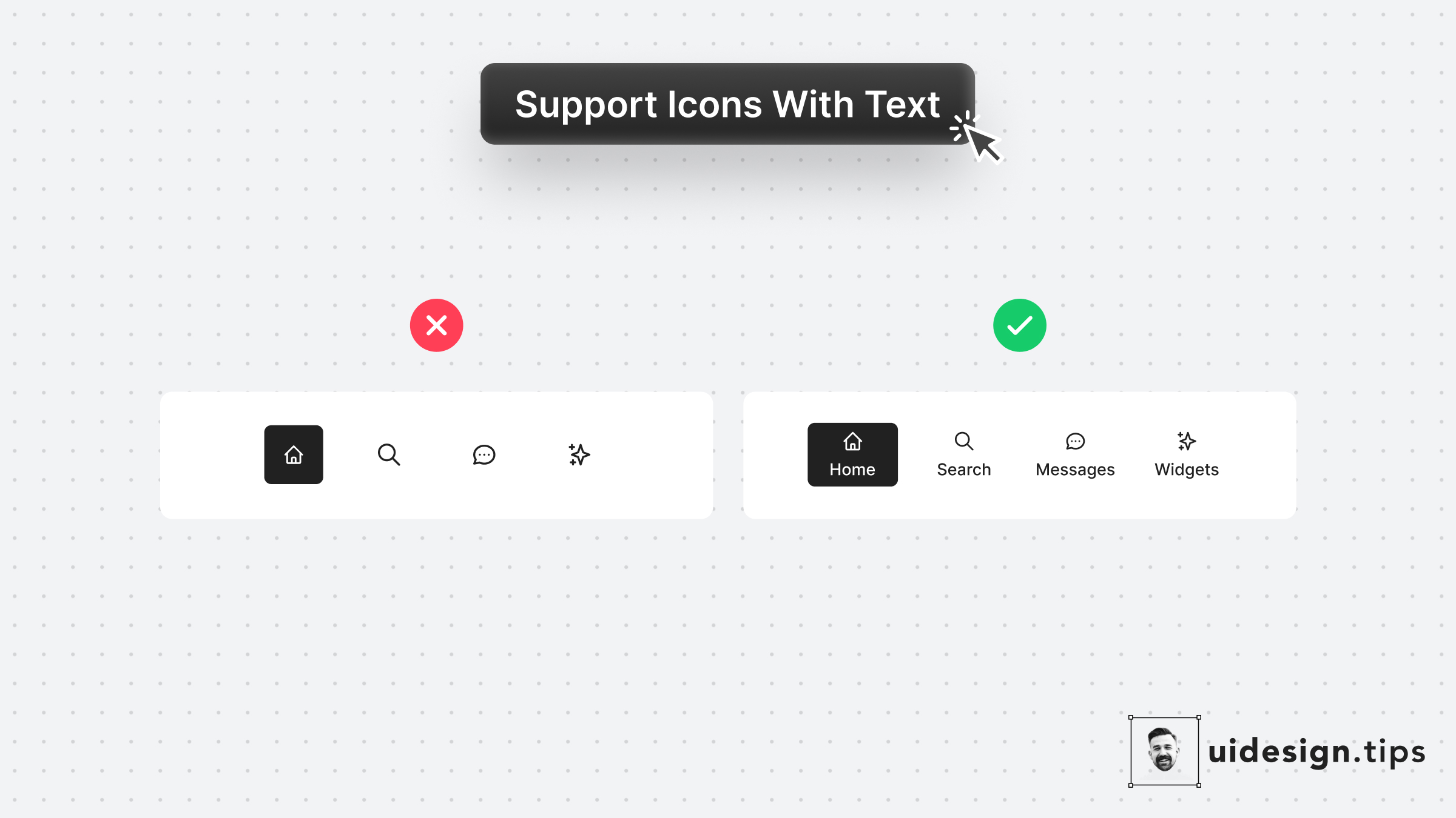
Support Icons With Labels
Icons can often confuse users or get misinterpreted by different people due to their experience level or even due to their culture. Fix this accessibility issue is by adding a subtle text label near the icon which will describe its usage. Keep this information in mind especially for mobile interfaces which don't support hover effects.
iconaccessibilityuxuimobile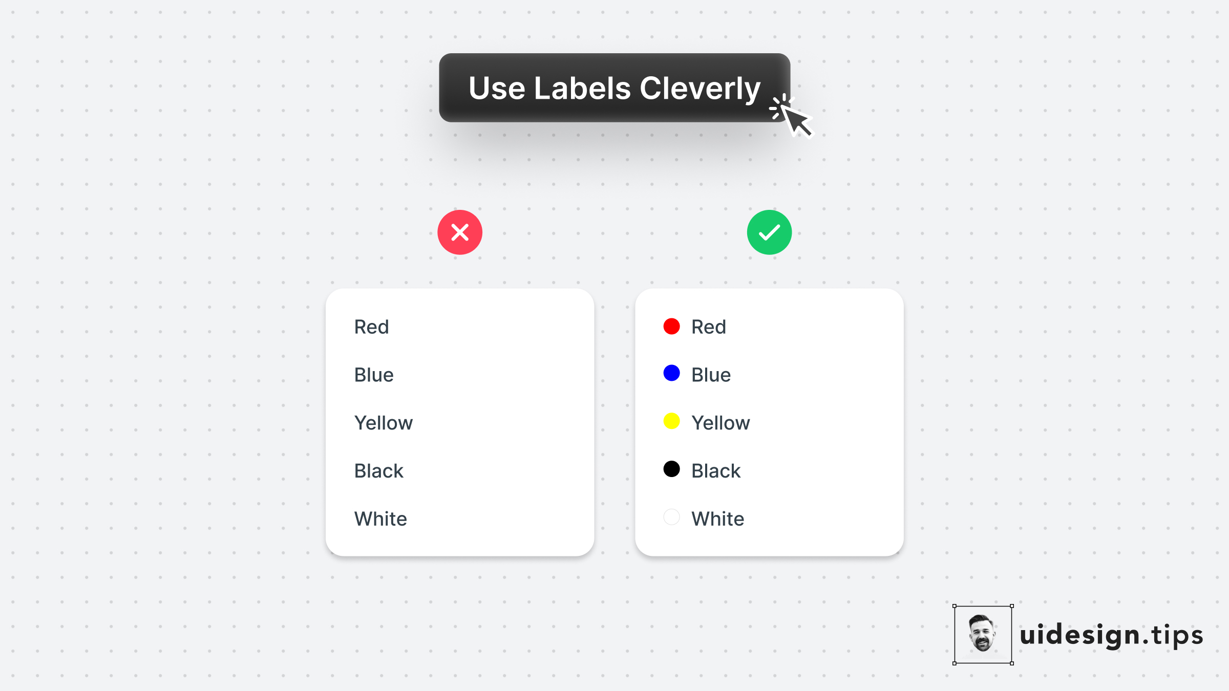
Use Labels Cleverly 2
A smart use case for labels is on color pickers with predefined values. Depending on the app's context you can even omit labels. Consider keeping them for color-blind people who struggle to identify colors though.
accessibilitylabelsformsux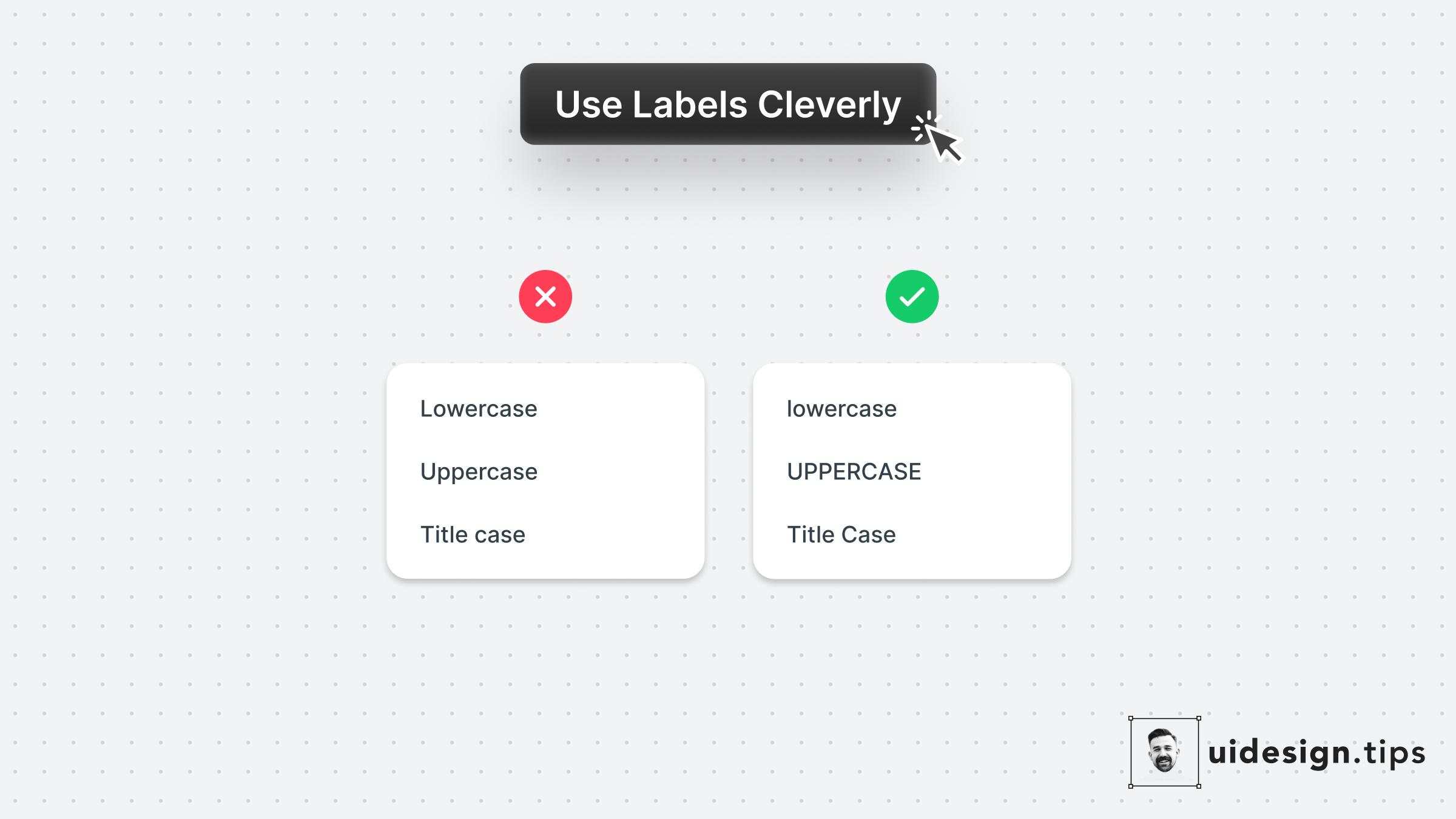
Use Labels Cleverly 1
Complement your link copy with a visual representation of the selected value. In this example, the labels show you how capitalization will look. It's not always possible to do this hack, so go all into it when the opportunity presents itself.
labelsuxforms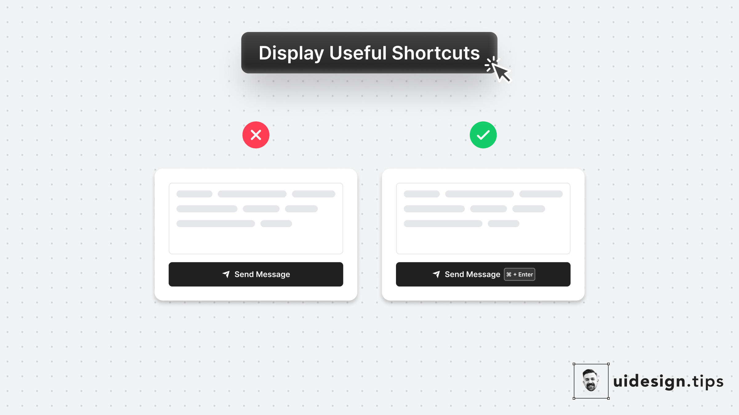
Display Useful Shortcuts
Keyboard shortcuts boost productivity and save time for power users. Yet it's sometimes difficult to remember them. Take advantage of Fitts's law* and place your shortcut keys next to the action button. In that way, the user doesn't need to remember the action. *The time to acquire a target is a function of the distance to and size of the target.
ux-lawsctauxon-boardingui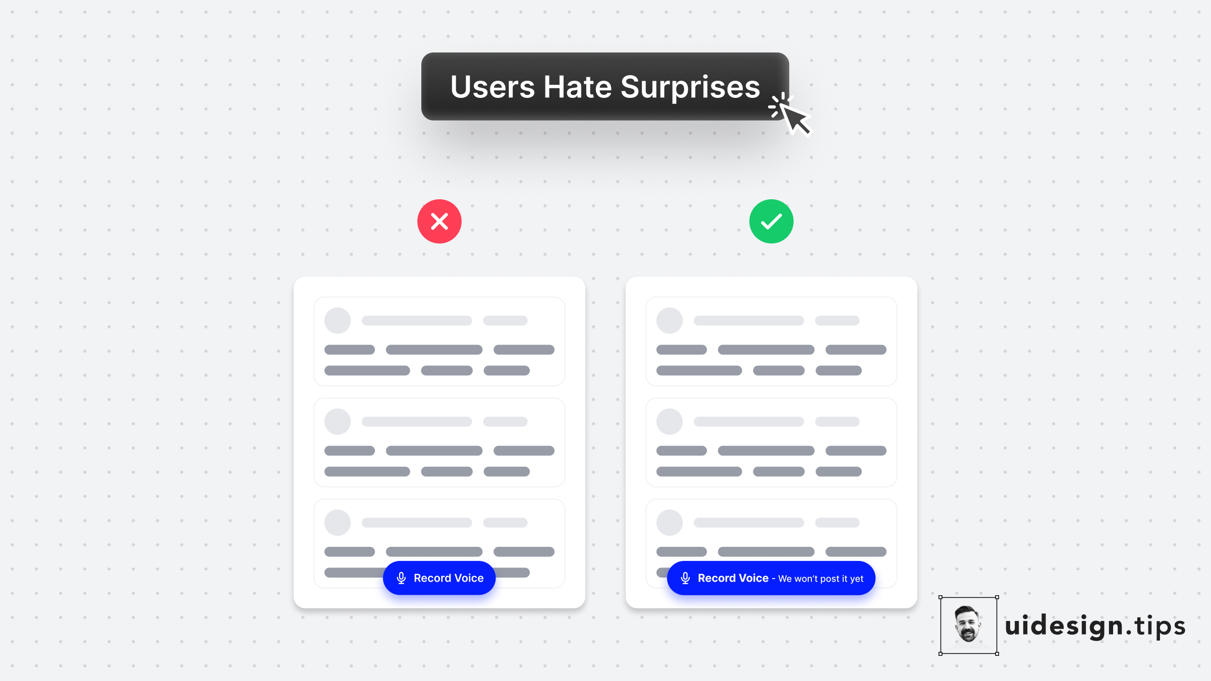
User Hate Surprises
With a simple UX copy adjustment, you can avoid misunderstandings and upgrade your product experience.⠀ ⠀ This is a real-life example from the voice messaging app [Yac](https://www.yac.com/).⠀ ⠀ I literally spend 30' wondering if the app will auto-post my voice message in the channel or allow me to hear and edit it first.⠀ ⠀ In the end, I recorded it on my phone and hit the "Record" button with the recorded message ⠀ A tiny detail can introduce so much friction!⠀
uxcta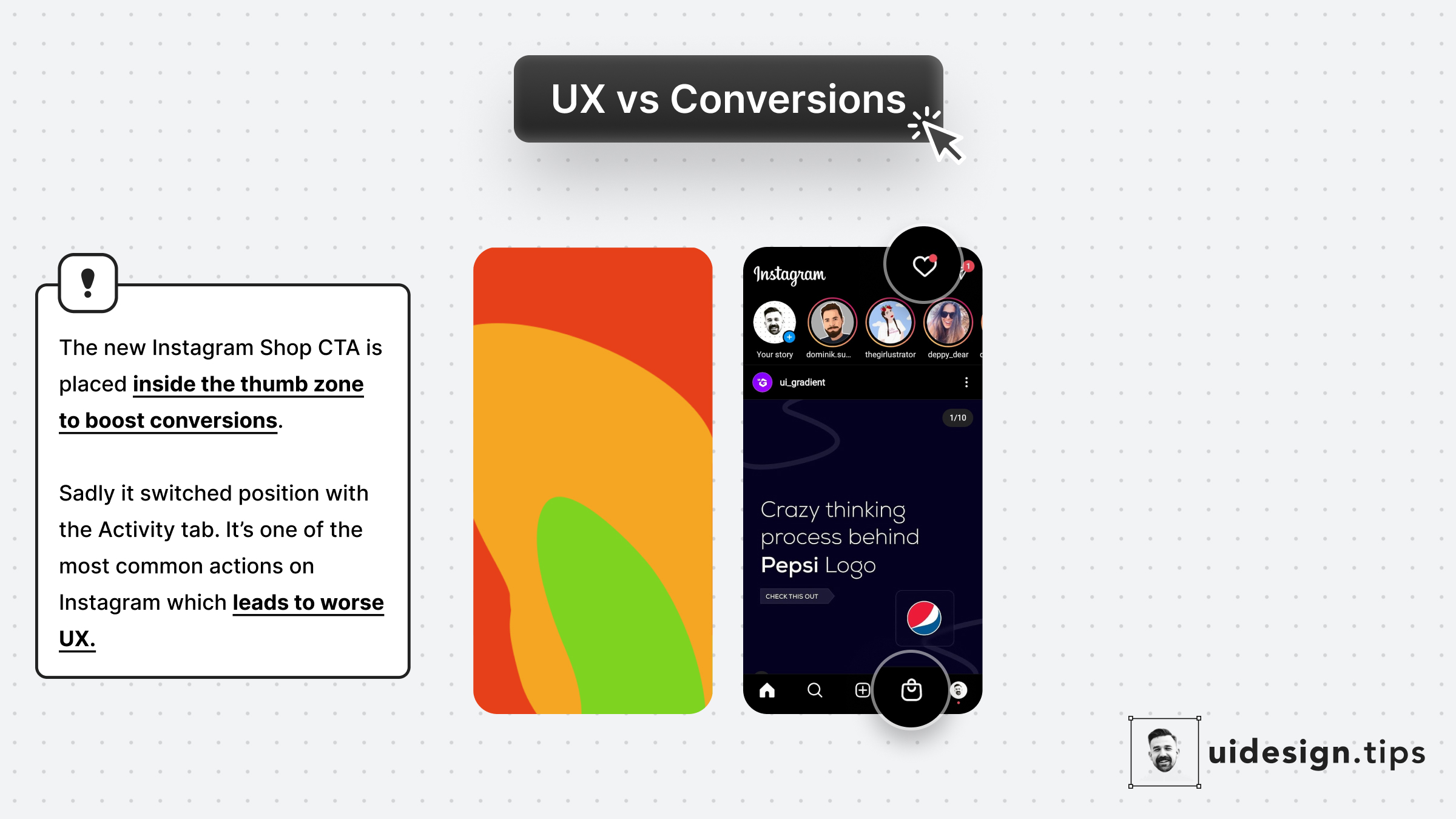
Prioritize UX
Instagram recently launched Shop. The decision to place it at the position of the Activity tab is not random... 1. More reachable since it's in the Thumb Zone 2. More accidental clicks bc users will reach for the activity tab This might lead to better conversions but make the user experience x10 worse. 10 annoyed users are far worse than an extra customer.
conversionsux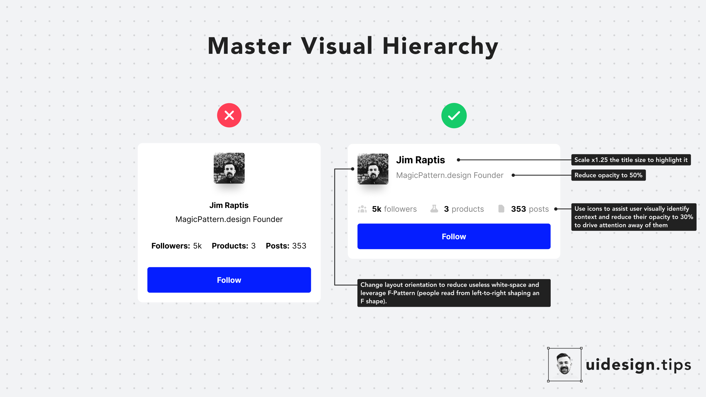
Hack Visual Hierarchy
Hack visual hierarchy with these simple hacks: • Reduce the opacity of secondary info • Use bold font-weight to emphasize • Scale your title's size by a fixed ratio (eg x1.25) • Arrange elements to the left side (for LTR users) • Group together relevant elements
howvisual effecthierarchyuxui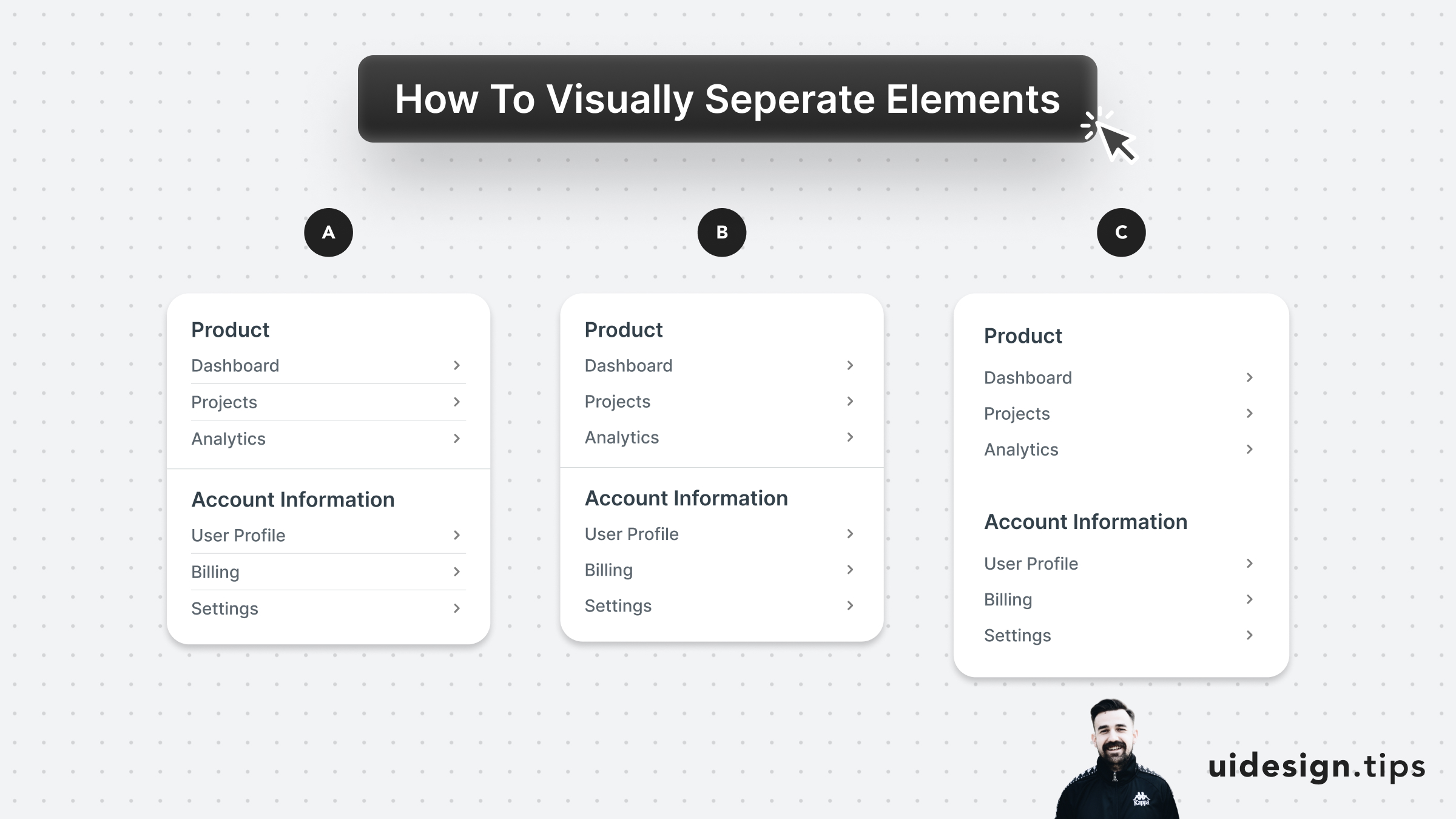
Visually Separate Elements
Prefer to visually separate menu sections with whitespace. Whitespace makes the UI look cleaner and request less cognitive effort from the user. In the example below: - A uses dividers for everything - B uses a divider between sections - C uses only whitespace A is too complex and distracts the user, but both B & C can be used on real-life user interfaces. B puts more attention on differentiating the sections. C makes the UI look cleaner.
visual effecthierarchyuiuxwhitespace
